 |
 |
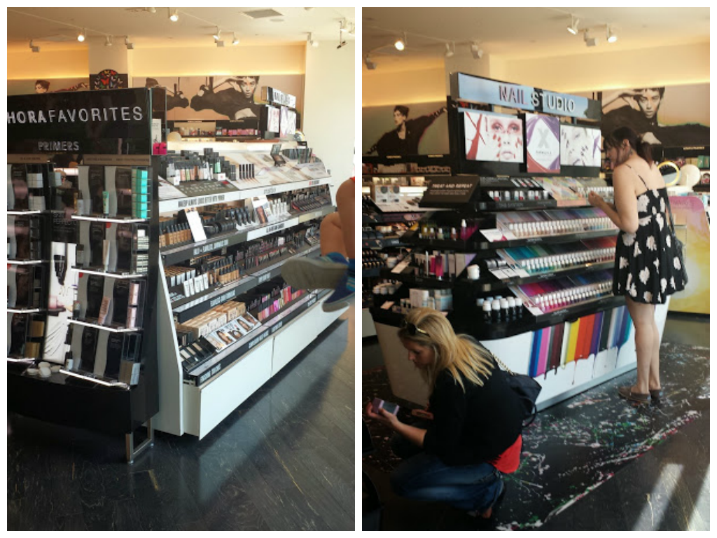
| When a consumer first steps into Sephora, they have an option to either walk to the left or the right. I interviewed one of the workers at Sephora and she mentioned to me that it has been studied that when most people walk in somewhere, their inclination is to walk to the right. Since people are naturally inclined to walk towards the right, they use this knowledge to make the right side even more appealing by using the the technology of layout and display. The first display on the right is a big circular table that has all the makeup and products from the brand Smashbox, one of their cheapest brands.The circular table is placed right next to the nail studio; the nail studio is composed of a big open tabled display that contains all the different colored nail polishes. The first color one sees when viewing the nail studio is the color blue. The color blue has been proven to be more appealing in regards to purchases. A study done by Bellessi proved that the color red had negative impact when one is placed in a setting of consumerism especially in contrast with blue. This study is one that is beneficial to Sephora because of their interest All of this color makes the right side appealing. The study resulted "Marketers would like to create positive, comfortable, pleasant atmospheres conducive to product evaluation and purchase decision making. Based on the results of this (dual) experimental study, blue environments are more appropriate than red environments for creating the desired atmosphere." (Bellizzi 15). The study proves why Sephora chose the color blue to be the first visible color in the nail studio by the consumer. The psychological impact allows for the customer to now be in a mentally relaxed state of mind so that they feel comfortable enough to make decisions regarding their spendings. This persuades the visitor to stay on the right side of the store where the blue is first noticed. The nail studio is placed in a relationship of proximity with the less expensive brand. The colors of the nail studio brings in attention from the visitor and the low cost of the brand along with its labeling keep the customer lingering for a while. |
 |
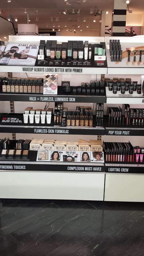
Once arriving to the first circular display, the labeling and captions tell you why you need that specific product. The circular display is an institutional technology because it is an object that not only displays makeup but also makes it accessible to the consumer.The way in which the circular display makes the makeup accessible to the consumer is what creates the consumer into a subject. The consumer is now a subject because of the access they have to the makeup. The circular counter creates easy access to the cosmetics, giving the subject the power to choose their makeup. The first caption on the top right reads "makeup always looks better with a primer" establishing a relationship between the subject as the customer and the object as the primer. Since the company produces makeup, they are held as the highest knowledge of makeup authority. Sephora uses this authority to make a truth claim holding that makeup looks better with a primer. This is suggesting that you as the subject that is buying the object in this case, makeup, needs a primer, another object, so that your makeup looks better on you. This causes the subject to believe that the primer is a necessary object if the subject also plans on buying makeup. Without the subjects, the sign loses it's meaning because the makeup and primer are worn by the subject. Both the sign and people give life to each other in the context of makeup buying. This statement is based off of the assumption that the consumer intends to buy makeup. The idea of using makeup is to improve ones' appearance. Here what we see the store do is play on in-store-decision-making since "In-store decisions occur because stimuli encountered during the trip (e.g., point-of-purchase advertising, the physical product) lead consumers to believe or recall that they have a need for the product category" (Inman 20). Since Sephora is categorizing the primer as something that is needed to make makeup look better, they are leading customers to believe that they need this product so that their makeup can reach its fullest potential. After all makeup is considered very important to women because "Cosmetics offer women not only enhancement and the correction of perceived imperfections, but also the promise of social and sexual success and a positive sense of self" (Miller 9). They are assuming you are already using makeup, but to look even better you should buy the primer. This is where we see the way in which Sephora is manipulating the idea of beauty. |
| The way in which Sephora presents the primer to the consumer creates the idea in the consumers mind that they need the product. What the store does is it tell you that if you use the primer before you apply makeup, your makeup will look even better. This is an example of information asymmetry. In an article by Fabrice Larceneux this idea is further explained: "Information asymmetry results when a producer has information about the quality of a product and the consumer does not" (Larceneux 62). Basically, the producer, in this case Sephora, is telling you, the consumer, that you need the product and that you should trust the store because the store knows what it's selling. It is a form of power knowledge.This is because the consumers will look at the recommendations of the store as being the best advice for makeup that they can receive. The store is manipulating their knowledge on the primer by informing the consumer about the primer and why they need it. They want to convince you into buying not only the makeup but the primer as well. Because Sephora is a makeup store, they are assuming that you already use makeup. Since you already use makeup, you might as well also buy the primer so that when you apply the makeup on your face, it looks its best. | 
|
| Bellizzi, J. A., & Hite, R. E. (1992). Environmental Color, Consumer Feelings, and Purchase Likelihood. Psychology & Marketing, 9(5), 347-363. | Inman, J. Jeffrey, Russell S Winer, and Rosellina Ferraro. "The Interplay Among Category Characteristics, Customer Characteristics, And Customer Activities On In-Store Decision Making." Journal Of Marketing 73.5 (2009): 19-29. Communication & Mass Media Complete. Web. 29 Apr. 2014. | Larceneux, Fabrice. "Critical Opinion as a Tool in the Marketing of Cultural Products: The Experiential Label." International Journal of Arts Management 3.2 (2001): 60-70. JSTOR. Web. 05 May 2014. | Biddle-Perry, Geraldine, and Janice Miller. "…And If Looks Could Kill:" Making Up The Face Of Evil." At The Interface / Probing The Boundaries 57.(2009): 7-23. Communication & Mass Media Complete. Web. 24 Apr. 2014. |