
  |
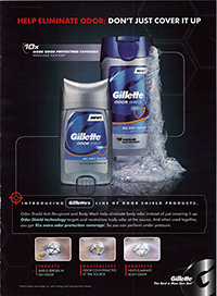
Another route is the use of militaristic, combative rhetoric and promises of dominance in which hygiene is weaponized. Men's body wash provides an "odor shield" and "unleashes the power to defeat dry skin", allowing you to "unleash the power of your shower" and "step out of the shower feeling like you can take on the world". One ad claims its product "targets" and "protects" (accompanied by a red crosshair symbol). These ads are structured as though (and bolster the assumption that) marketing to men entails framing the use of the product in terms of combatting an enemy, gaining dominance, and accessing power. Like male-targeted advertisements linking sports and beer, these ads "are reliant on strategic castings of 'how men are'," in this case participating in a discourse that claims men are inherently drawn and predisposed to violence and antagonistic relations (Wenner 121-122). |
| Dial's ad takes a similar route, advertising their product on the basis that it will help you "smell taller". Height does not have a smell; the claim is metaphoric: when read in the context of previous examples -- that is, when read intertextually -- the ad can be interpreted as drawing a link between the smell of the product, the size of a man, and powerful, confident authority.
This follows the same pattern discussed by Jewitt and Oyama in their article on visual meaning, which asserts that "if you want to express that something or someone [depicted in an image] is impressive and powerful, you are unlikely to choose a high angle" (Jewitt 135). A high point of view is linked with power of the viewer over the viewed (Jewitt 136). Thus, an increase in tallness from the subjective or audience standpoint stands in for a metaphorical increase in power over others. |
 |


 |
But the fontface of the text has a story of its own to tell. Within a discourse of men's body wash, there is a discursive formation -- which is a "way meanings are connected together," a regularity of "relations between parts of a discourse" -- within the font design (Rose 191). Fonts in these ads are large, simple, bold, blocky, angular, and square, representing the idealized male body type (as is represented in the ads that feature human subjects). One example where this does not hold true -- where the letters are curled at the ends -- is where the text is presented underneath the image of a feminine-coded figure. Thus the ads textually echo the gender norms of body shape, and as well as norms around how we describe those bodies -- muscular men are also "curvy", in their own way, what with the lumps that form washboard abs and the rounded bulk of biceps and pectoral muscles, but conceptually they are never described or regarded as such, and the text aligns itself with this paradigm. Also, much of the text across ads is written in capital letters, which are associated with loudness (and by extension, aggression). |
 |
Paired with masculine-coded figure: |
Paired with feminine-coded figure:
|
|
Axe Ad 1. N.d. Graphic. Adpressive. Web. 4 Mar 2014. (http://adpressive.com/wp-content/uploads/2013/01/axe-clean-dirty.jpg). Axe Ad 2. N.d. Graphic. MsMagazine. Web. 4 Mar 2014. (http://www.msmagazine.com/summer2011/images/nocomment_axe.jpg). Axe Ad 3. N.d. Graphic. The Axe Effect. Web. 4 Mar 2014. (http://www.theaxeeffect.com/img/thumb/large/Mito_Large-Thumbnail.jpg). Dial Ad. N.d. Graphic. Typepad. Web. 4 Mar 2014. (http://brandmediaweek.typepad.com/.a/6a00d834519bc269e20120a537531c970c-600wi). Dove Ad 1. N.d. Graphic. Business Insider. Web. 4 Mar 2014. (http://static6.businessinsider.com/image/4b75bc620000000000408c43-480/david-shapiro.jpg). Dove Ad 2. N.d. Graphic. Greg Shortall. Web. 4 Mar 2014. (http://gregshortall.com/wp-content/uploads/004_bodywash-print.jpg). Gillette Ad 1. N.d. Graphic. Wordpress. Web. 4 Mar 2014. (http://anadaday.files.wordpress.com/2010/05/gilletteodorshieldprint.jpg). Gillette Ad 2. N.d. Graphic. Coolspotters. Web. 4 Mar 2014. (http://www4.images.coolspotters.com/photos/635457/bryce-draper-and-gillette-fresh-clean-cool-wave-body-wash-gallery.jpg). Gillette Ad 3. N.d. Graphic. Stephanie Stroh. Web. 4 Mar 2014. (http://stephaniestroh.com/wordpress/wp-content/uploads/2012/02/gilette.jpg). Jewitt, Carey, & Oyama, Rumiko, "Visual Meaning: a Social Semiotic Approach," in Theo van Leeuwen & Carey Jewitt (eds.), Handbook of Visual Analysis (London: Sage, 2001) Nivea Ad. N.d. Graphic. New York Times. Web. 4 Mar 2014. (http://www.nytimes.com/2009/09/08/business/media/08adco.html?_r=1&)., pp. 134-156. Old Spice Ad 2. N.d. Graphic. Wordpress. Web. 4 Mar 2014. (http://marketingstylee.files.wordpress.com/2011/01/old_spice_the_man_your_man_could_smell_like.jpg?w=630). Old Spice Ad 4. N.d. Graphic. GGPHT. Web. 4 Mar 2014. (http://lh6.ggpht.com/_QjuvIeixiOs/S3m937mddUI/AAAAAAAACHo/zwDK0WdCZ8Q/s800/old%20spice.jpg). Rose, Gillian. Visual Methodologies. 3rd ed. London: SAGE Publications, 2012. Print. Wenner, Lawrence A. "Brewing Masculinity". Sport, Beer, and Gender. New York: Peter Lang Publishing, Inc., 2009. |