

I will first analyze the look of the website itself, in order to create an introduction of
sorts by using what the interested viewer sees first from the company. Upon first arriving at
roadtripnation.com, one finds their title image in the upper left-hand corner, with links above
it to further organizational information and next to three links to different parts of their
organization: the show, the interviews, and the opportunities to participate. Taking up the
center of the page is a set of scrolling images advertising various aspects of their work: their
show, how to get involved, and their work in education. Beneath that are more links to their
social media sites. The graphics use a motif of an artistic combination of photography and seemingly
hand-created art. This style, along with their organization of links and images, has significance
in that it creates a specific discourse, a way for viewers to understand their message. This discourse
manages to both direct their readers' attention to the work they believe to be most important and
to minimize their impression as an institutional establishment.
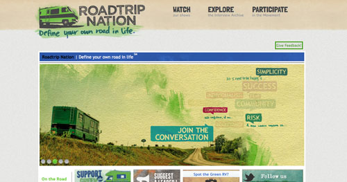
Dominating the first impression of the page is the wide horizontal box of images that scroll through automatically. The first advertises the newest episodes of the 9th season on television, the second advertises a live showing, the third hopes to convince viewers to "join the conversation" about what travel can do for a person, the fourth is for their DVD release of season 8, and finally the last hopes to convince visitors to check out their involvement in education reform (roadtripnation.com). From these, a few values can be drawn because of their central alignment on the website: their show takes precedence, as well as their general message and their activism in education.
Kress and van Leeuwan theorize this sort of placement when they discuss the information values of the center versus the margin: "For something to be presented as Centre means that it is presented as the nucleus of the information to which all the other elements are in some sense subservient. The Margins are these ancillary, dependent elements" (Kress and van Leeuwan 196). With the scrolling nature of the images, each one gets to be central at least some of the time. Unsurprisingly, this is reflected in other ways: the three links up top mimic the same values with their chosen words being "watch," "explore," and "participate" (roadtripnation.com). These links are slightly more marginal, but they are more obviously active links, using specifically imperative verbs to catch the attention. Once the reader comprehends the importance of the larger images in the center, they can click through the links above to become more involved.
Some aspects of their work simply did not make the cut when the designer thought of what to emphasize. For example, their store is mentioned only in small ways, one on the very bottom of the page and another at the very top, neither in large font. They also refer to themselves multiple times as a "movement" rather than an organization or a company (roadtripnation.com). I have deliberately chosen to switch between these words in this analysis because I feel the connotative difference here is important. Roadtrip Nation in many ways must operate in both ways: as an organization which promotes a certain set of charitable ideals, and as a company which makes profit. They never use the word company, because it would be at odds with the ideology presented. Organization is less active than movement, though, so it seems as though movement was chosen to emphasize the participation aspect of the viewers. This is a different sort of organization, sorting meanings into one word which they feel best represents what they actually do and how they want to be seen.
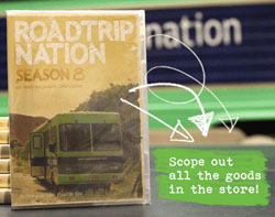 |
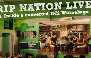
All of this is also tied to the style of their images. Rose, summarizing Foucault, describes a discourse as "disciplines subjects into certain ways of thinking and acting" in the way that it "produces" human subjects to follow along (Rose 192). In order for a discourse to be established, there must be multiple images contributing to it. For example, the title in the left hand corner looks as though it were partially spray-painted, partially handwritten, and partially done with watercolors. The second image on the scrolling list of pictures shows a photograph in the background, with information about a showing of their live interviews sketched over it in block letters. Advertisements for the most recent season of their show include "hand drawn" arrows coming off of the DVD case. I point these out because this style of image is being used to create a very specific idea of the nature of Roadtrip Nation. It is shown to be dynamic, youthful, and definitely not formal in any way. These are reflected in all areas of the show, including in the television program that is broadcast, but I find it interesting how they are present even in seemingly simple graphics. |
|
These values are not wholly unique to Roadtrip Nation or to the United States. Other writers have written on
programs which seek to achieve similar goals. Elfriede Fursich seeks to theorize travel programs in general in
his article "Packaging Culture: The Potential and Limitations of Travel Programs on Global Television." On the
prevalence of travel programs, he says: "What might appear to be an innocent form of nonfiction entertainment,
producing and reproducing trivial, positive images of exotic places, can be analyzed with regard to its discourse
of the foreign and the familiar as it is inflected by the material conditions of power. This research contributes
to the broader goal of studying tourism as a major cultural (political, economic, social) practice of global
dimensions" (Fursich 205).
While Fursich's analysis has specifically to do with how travel programs act in global settings, I believe similar comments can be made about strictly USA travel. There are undoubtedly areas and cities which have more power than others, which are affected by tourism, and whose images are broadcast worldwide. In Roadtrip Nation's case, it is about romanticizing the idea of not being a tourist, of travelling to further understand the self and the country. Looking at travel this way ignores certain things the same things as the global programs that Fursich criticizes. Lonely Planet uses the same idea of "untourism" as a way to gain more authentic experiences, but, as Fursich points out, "the commercialized and commodified environment in which Lonely Planet airs contradicts the independent and critical perspective of its untourist perspective" (Fursich 211). I would argue that Roadtrip Nation ends up creating a similar problem by producing their documentary. |
 |
 |
Chris Healy and Alison Huber work toward similar analysis in their essay, "Ask the Leyland Brothers: Instructional TV,
travel, and popular memory." Ask the Leyland Brothers was a program based in Australia in the 1970s and 80s which
explores themes of cultural memory and appreciation of one's own country. One theme the authors pick up on are
the similarities created between traveler and television viewer: "both TV watcher and traveller 'go places' - one
virtually, one literally. Both are invested in 'seeing', deriving the pleasure and experience of a place through
the visual" (Healy and Huber 392). I would say that Roadtrip Nation produces the same feeling of closeness between
the roadtrippers and the viewers of the show (or the visitors to their site).
However, Healy and Huber go on further: "[Ask the Leyland Brothers] does not simply reframe the travel narrative tradition using the medium of television for a new kind of lounge room-bound audience. Rather, the Leyland Brothers produced and distributed travel and television on the same cultural plane... At the same time, in order to, in a sense, bring this world into existence, ATLB moves beyond the television, to both incite the desire to travel in its audience and instruct that audience about how to 'do good travel'" (Healy and Huber 392). This ties in incredibly well with the way Roadtrip Nation presents their mission, considering their beliefs on the wider importance of travel and the implications it can have for self-understanding. By encouraging others to travel, they are essentially recruiting people to believe in that with them. |
|
Clearly themes of travel are important on a global scale, as shown by these analyses. I still believe, though, that
the United States brings a slightly different aspect of self and independence to travel than do other parts of the world.
This is reflected in Roadtrip Nation's goals, which ostensibly seem to be to help young people find themselves and discover
what makes them happy in life. These other programs, while they do pull in aspects of this, involve a wider understanding
of using travel to understand the world better. Roadtrip Nation tends to focus ultimately on the self: travel is more of
a tool for self-discovery than a tool for understanding others, although the other is present to some degree as well.
Interesting, though, is the way they compromise their own mission through their own broadcasts. Packer and Oswald theorize this phenomenon in their article, "From Windscreen to Widescreen: Screening Technologies and Mobile Communication." They seek to combine theories on automobility and on modern communication, coming to the conclusion that through greater mobile communication technologies, more control is exerted: "it is not only a matter of control but also one of connection - a sort of networked control, in which control is exerted by, on, and through each node, each privately or publicly mobile user, as they move from orbit to orbit... This is of critical import: If the car becomes an open site, then it can be taken over externally" (Packer and Oswald 335). By broadcasting the interactions of the roadtrippers as they travel, they attempt to make the entire experience open and enlightening. What Roadtrip Nation may not consider is the importance of social governing agents that can therefore work their way into the show. |
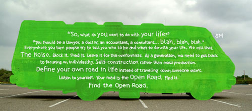 |
Gramsci also argued that there would be resistance to hegemony, resistance he called counter-hegemony" (Rose 268). Roadtrip Nation seeks to be the counter-hegemonic source in a society dominated by a very narrow definition of success. Roadtrip Nation offers a world where students get the opportunity to explore their interests and find happiness, instead of a vision where students attempt to choose a money-focused career at a young age. The hegemonic image they seek to fight is a scene often found in public high schools (or middle schools, or elementary schools). I remember being asked to work on career quizzes as young as 11 years old with the emphasis on a strict definition of what constituted a successful career, something which Roadtrip Nation would find deplorable. Through their non-traditional style of graphics, they communicate a lot about their desire to uproot traditional modes of thinking about what it means to be successful.
 |
Home |  |
Works Cited:
Fursich, Elfriede. "Packaging Culture: The Potential and Limitations of Travel Programs on Global Television." Communication Quarterly 50.2 (Spring 2002): 204-226. Print.
Healy, Chris and Alison Huber. "Ask the Leyland Brothers: Instructional TV, travel and popular memory." Continuum: Journal of Media & Cultural Studies 24.3 (June 2010): 389-398. Print.
Kress, Gunther and Theo van Leeuwan. "The Meaning of Composition." Reading Images: The Grammar of Visual Design, 2nd ed. London: Routledge, 2006. 175-214. Print.
Packer, Jeremy and Kathleen F. Oswald. "From Windscreen to Widescreen: Screening Technologies and Mobile Communication." Communication Review 13.4 (2010): 309-339. Print.
Roadtripnation.com. Roadtrip Nation, 2013. Web. 23 Apr 2013.
Rose, Gillian. Visual Methodologies: An Introduction to the Interpretation of Visual Materials. 2nd Ed. Sage Publications: Washington DC, 2007. Print.