Airports as Helpers

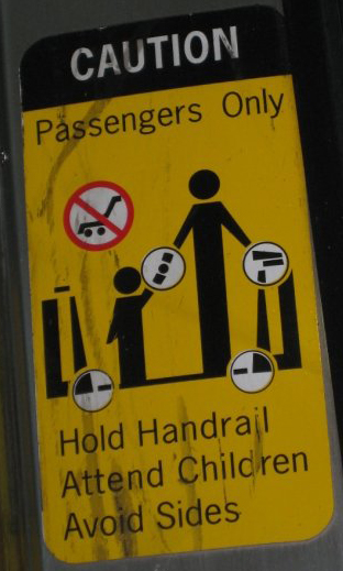
The ideas of co-construction and the living airport, expressing its power and knowledge upon people through ads, pictures, and lines, can been seen through a somewhat different lens. Emmison and Smith talk about how "Barthes was able to do this because he understood that mythologies were not simply layered on top of the 'real world' by post hoc advertising campaigns, but rather were built into the fabric of objects and practices" (Emmison 108). For Barthes then, it was the idea that the pictures were built upon their expression rather than their objective visual meanings, creating a sort of experience through these images that became examples instead of authority figures that forced action. The shift of the idea is the movement from the airport as a monster that tries to control its inhabitants to a director of long range traffic with friendly signs to help the lost consumer. The best way to help a passenger is, as Emmison and Smith describe, building "into the fabric of object and practices" the images themselves, which became real life examples instead of just a bunch of signs informing others what to do. This is seen in the escalator caution sign specifically, because the practice of "passengers only" is safety. Thusly, as the people board the escalator, they are still admitting to be passengers, but hold the handrails, attend children, and avoid the sides not because the airport has some sort of power that it forces such obedience, but rather because the airport knows better and wants the passengers to be safe. The difference is like that between offering guild lines and forcing the suggestions onto people, much like the difference between a personal trainer, who cares for their trainee, and a drill sergeant who forces recruits to do push-ups without question.
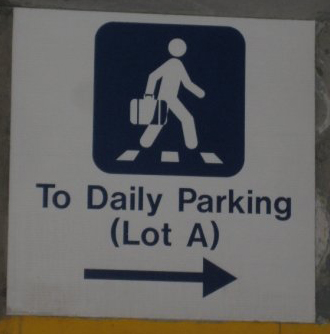
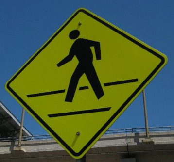
Should this be true and the signs are being the example, then one question that arises is why such oversimplified images are used. It would not be much harder to use actual pictures of people in these signs and may even give a little more information. Leeuwen and Kress offer a reason behind this simple yet incorrect statement of what people in airports (or people in general) look like. They say that "in order to move from the reality to its photograph it is in no way necessary to divide up this reality into units and to constitute these units as signs, substantially different from the object they communicate... certainly, the image is not the reality but at least it is its perfect [analogue] and it is exactly this analogical perfection which, to commonsense, defines the photograph" (Kress 23). It is this idea, that circles hovering above a rectangular body with strangely shaped legs, that is okay to have, but why? How did this become the norm for presenting people taking action, especially in the concept that these images are supposed to present the "real life example" of how to take action in and around the premises? It seems that the airport pictures become a "conventional visual arrangement, based on a visual code" (Kress 23). Since code is always created with power structures in place, then the airport has seemingly used its authority to create basic ideas that are good enough to guide willing people. The application of this idea also allows multiple audiences to access the information; even those that have never before seen signs like this would likely comprehend the idea that the people represent the person(s) looking. Thusly, the power that has been encoded into the signs of the airport seem to carry with them the power/knowledge that to generalize, overemphasize, and simplify possible characteristics is not only expected but also, due to the large extent of its audience, welcomed. The effect this has is that "the new climate of interactivity blurs the dividing line between producer and consumer" (Poster 327). It is in this blurring of the line that allows the airport to help with providing the example for the people while at the same time addressing the masses in an easily understood way. Doing this, both the airport and those that go to the airport take part in what is called the logonomic system, agreeing upon specific regimes for how to produce and receive specific meanings in the images.
These sets of rules play out "by concrete social agents...coercing concrete individuals in specific situations," in this case the airport persuading the passengers through riding the escalator, guidance through finding parts of the airport, and instructing them as to how to behave so that the fastest movement is possible (Rose 101). It is possible that this agreement goes under the consciousness of the people and this for two reasons. The first is that if the agreement is not recognized by the people, then the airport becomes more likely to be seen with more power than it actually holds, thus improving the likelihood that people will be persuaded by the advertisements in the airport. The second possibility is that it has been used to the point where it is simply not brought to attention at all because it does not matter. Which one do you think the airport wants you to think is true?

HOME PREVIOUS NEXT