
Facebook has more users in more countries than any other social media platform on the planet. For this reason, it makes sense that their home page is as user-friendly as possible. It is incredibly straightforward, helping people who may not be particularly technically oriented figure out how to sign up and begin to operate the features of the website quite easily. Compared to many of the subsequently analyzed websites, Facebook is probably the least complicated to use, especially on a basic level. In a study conducted by Zizi Papacharissi, it was found that, “Facebook emerged as the architectural equivalent of a glasshouse, with a publicly open structure, looser behavioral norms and an abundance of tools that members use to leave cues for each other.” (Papacharissi, 2009) One of these tools which is often used is the instant messaging system on the site. This application also features a face-to-face online video chat feed, similar to ‘Facetime’ and ‘Skype’. In a study conducted analyzing the effectiveness of these sorts of technologies in schools, it was found that “The analysis of the students’ work further found that a higher level of discussion was generally associated with the shared interaction pattern.” (Chung, C-w, C-c. Lee, & C-c. Liu, 2013) This information tells us that the way that Facebook chooses their applications wisely, making them even more appealing. This ease of use and the “abundance of tools” provided by Facebook are two aspects of the site that are most likely some of the leading causes behind their extreme success.

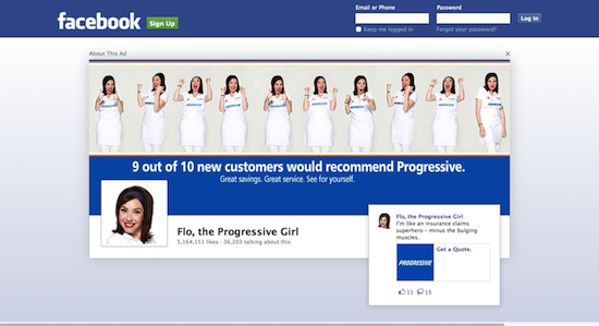
A somewhat recent addition to the Facebook homepage is the incorporation of advertisements which often stretch over the entire screen, leaving only the top bar to indicate what website the user is visiting. Although this does not draw away from the ease of use, it may come across to some long-time users as annoying or inauthentic. According to Giorgio Brajnik and Silvia Gabrilelli, “Users may develop negative attitudes toward websites hosting the adverts, leading to reduced visit duration, fewer visits, fewer referral chances, increased negative word-of-mouth.” (Brajnik & Gabrilelli, 2010) The choice to contract with a company that uses an almost identical color scheme was presumably a carefully planned marketing strategy, in order to keep the page looking ‘like Facebook’. Either way, it works, providing users with a sense of consistency with one of their most often visited websites. One main reason why this is important can be found in an ethnographic study conducted by Eliot Knight, Charlotte N. Gunawardena, and Cengiz Hakan Aydin, which aimed to – among other outcomes – determine the relationships that viewers create with websites. In their work entitled Cultural Interpretations of the Visual Meaning of Icons and Images used in North American Web Design, they posit that, “Images are a holistic source of information that involve the viewer on a personal and emotional level. Research indicates that viewers’ interpretations may incorporate background context drawn from personal concrete experience or from personal hypotheses regarding the image.” (Knight, Gunawardena, & Aydin, 2009) When applied to Facebook, this information tells us that although the integration of advertisements may on some level irritate users, the decision to maintain their familiar color scheme helps maintain the viewer’s sense of identification with the company and the homepage, and most likely does not deter usage. The decision to include an advertisement that looks fun and inviting also supports the hypothesis that these websites choose ads that reinforce their identities and the identities of their users. To help iterate this, Azizul Yaakop and Jane Hemsley-Brown note in their article Hedonic Pleasure and Social Image: The Effectiveness of Internet Advertising, that “Internet effectiveness is influenced by the capability of internet advertising to bring fun and entertainment (hedonic/pleasure); and to reflect consumers' social and self image (social role/image).” (Yaakop, & Hemsley-Brown, 2013) To finalize this point, while conducting a study analyzing the effects of advertising in social media websites, Shandana Zafar and Khan M. Majid found that “The overall attitude of young consumers is positive.” (Zafar, & Majid, 2011) Considering the vast number of younger people who use Facebook, it is not surprising that they would be willing to take the risk of integrating advertising into their homepage, even though many other websites such as Linkedin.com which pander mostly to adults would most likely not.
 |
As can be observed on the left, the login page for the mobile application does not diverge from Facebook’s laid-back, user-friendly design. It also, of course, keeps the familiar font and color, which gives the customer the same feeling of homeliness that they get when logging into the online website. In addition, I administered a small-scale ‘Audience Studies’ (Rose, 2012) ethnography that I conducted about the level of use of the Facebook mobile application by college-aged students on a daily basis in April 2013. My findings indicated that in this subgroup, the application was used extensively in almost any social context. This further supports my claim that Facebook’s aesthetics and especially its ease-of-use contribute to its astronomical success as an entertainment and social networking medium. |