Tyler Rankin's Final Project
Intertextuality Between the Covers
In order to first understand the implications of the various magazine covers, we must first examine
the visual and textual intertextuality between the covers. Rose defines interetextuality as "the
diversity of forms through which a discourse can be articulated" (Rose 142). The various
similarities and differences between the cover pages can show us ideas about ideal manhood and
will reveal the "discursive formation" prevalent in "Men's Health" magazine, but we must first
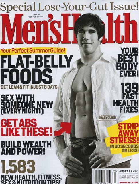
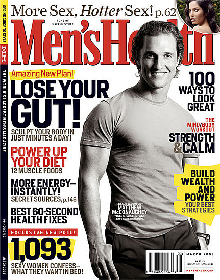
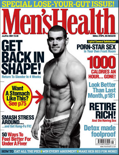
examine the similarities of the covers in detail. Firstly, there are a great deal of visual
similarities between the three pages. Each cover features the text of the name of the magazine,
"Men's Health", boldly and centrally located at the top of the page, each in the color red.
The color scheme of each cover is fairly monochromatic in tone, and does not feature the bright
pinks and greens that are often seen on women's magazines. Black, white, grey, and red are the
primary colors seen on each cover; yellow and blue are sometimes used, but not in a way that draws
attention to the brightness (rather, these colors highlight the monochromatic scheme). The color
scheme is meant to convey stark simplicity, a "no frills" approach is meant to appeal to male
readers. Each cover features a black-and-white picture of a man in the center of the layout. Each
man's body is turned slightly to the side, but not necessarily in the same direction. Two of the
men are bare-chested, and each picture depicts the men at an angle that accentuates their
"masculine" features (i.e. big shoulders, broad chest, large arms, high muscle definition, etc.) .
Also worth noting, each man is sporting an understated smile, none are expressing pain, anger, or
"toughness". Their gaze is directly at the reader, however, and the combination of both features
seems to give off an air of "effortless manhood." Each man is confident and at ease with his highly
defined masculinity.
Textually, there are a number of important similarities between the three covers.
The text divides the topics of the magazine into three main categories: work, sex, and body
(these will be expounded upon later). Two of the magazine are stated as "Lose Your Gut" issues,
where the primary focus of the health sections are regarding weight-loss in the abdominal region.
Two of the covers also feature the text "Health Fixes." The two covers which feature bare-chested
men, also feature text which points to the abdominal muscles of the models and claims that the
viewer is capable, and should want similar muscle tone. Throughout each cover, there is also an
emphasis on quantities. On each cover, numbers and digits are given prominent display.
These numerical quantities describe everything from the number of "health tips" in an article
to the quantity of calories the reader is able to burn using a particular exercise technique.
The specific, numerical quantities are a feature which is not often seen on the cover of women's
magazines, further promoting the idea that rational, logical, empirical data is a "masculine"
trait, and would therefore appeal to male readers. Throughout each cover page there a number of
texts which emphasize quickness and fast results. Indeed statements such as "Sculpt your body
in minutes a day!?" and "Fast health fixes" give the impression that the ideal improvement of
masculine health and lifestyle should be quick, efficient and explosive. This emphasis on quantity
and quickness is also connected with an emphasis on improvement and expansion that pervades the
differing covers. Approximately one quarter of the captions feature some sort of expansive wording
such as "feel better", "build wealth and power", "more energy", and "your best body ever". This
wording appeals to the "masculine" ideas of growth and expansion and points to a supposed
"intrinsic" desire for conquest which is often associated with masculine strength. This
expansion-oriented language also connects to other captions which use language to conjure up
violent and dominance-oriented imagery. Captions such as "smash stress around", "make her beg
for more" and various emphases on "power" are examples of forceful wording. It is also worth
noting that many of the captions use exclamation marks, which give the impression of yelling and
high volume. These combined traits give the impression of an encouraged and even expected violence
and coercion in masculine discourse. This violence is also noted by Dotson, who uses examples from
military recruitment commercials as evidence that contemporary media and society "has no trouble
imagining men killing men" but "cannot imagine the possibility of women killing women" (Dotson 53).
Indeed, violence, expansion, and cold, hard empirical logic seem to be the masculine ideals
embodied in the "Men's Health" version of ideal-manhood. An examination of the three main topics
reveals exactly how this discourse is espoused through the magazine, and how the body is used as
the means through achieving ideal-manhood.
Go to success
Back