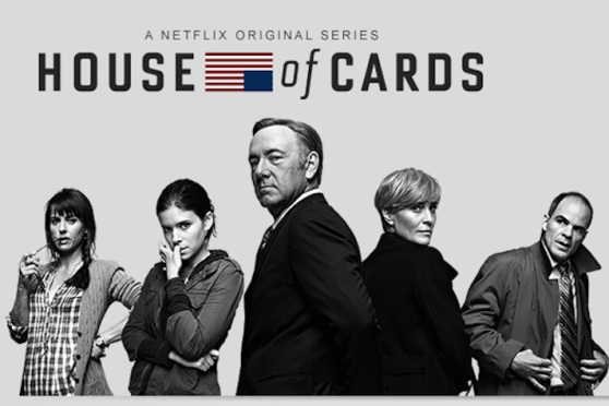

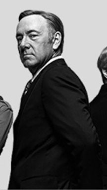
This House of Cards advertisement effectively pictures and portrays five essential characters within the series. Diving straight into the depth of the ad, I first focus on Frank Underwood (Kevin Spacey). Underwood's image is slightly larger than all other characters shown. The magnitude of a character's physical size is representative to his/her importance; the greater the size, the greater the importance. Focusing in on Underwood's face, we see his eyes are cast to the side and slightly down. His point of view is elevated above the viewer as he is able to physically look down on us. His facial expression is stern and stoic, yet also calm and watchful. His eyes hold a slightly disapproving glare as they are in a squinted position as if analyzing. Underwood is angled so that he is looking over his shoulder at the viewer, as if he is simultaneously watchful and disapprovingly turning a cold shoulder. The angle casts a shadow on one side of his face, possibly reflecting the duality of self seeing as Frank Underwood is often a two-faced character. Expanding our focus, we see Underwood's arms are folded behind his back and he stands with strong, proper posture. His hair is clean and styled in a very stereotypical and smart looking way with a receding hair line indicating age but more so experience. His suit is sharp and tailored, denoting his wealthy class and elevated status. Underwood is a character who treats Washington like a chess game. Every word, every action is highly thought out and at least three steps ahead of characters in his way. The stern cunning of this character is seen in his body positioning. With his arms neatly folded behind his back, we see he is a quiet character who does not call a lot of attention to himself in the ways the body positioning of other characters do. But this position also reveals his exposure and therefore lack of fear in his realm. His image appears thoughtful and calculating as he stands center stage of the advertisement.
Claire Underwood

Claire Underwood (Robin Wright), pictured on Frank Underwood's right, is a character with equal ability to pack a punch and fulfill a self serving scheme, yet her character is represented in a slightly different manner. Claire has her back completely turned from the audience as she twists her head over her shoulder to establish a connection with the viewer. Claire's over the shoulder glance cloaks her with a sense of coyness, yet her eye contact is direct and right on eye level with the viewer. This angle allows us to see the strong set facial structure and expression of the character. In advertising, it is not unusual for a woman to be in this position, looking back towards the camera and ultimately the voyeuristic audience (Oswald, 2013). Keeping all of this in mind, it is pointed out that even when women are depicted in strong, professional roles, "an expression or other detail presents them as less serious" than men who are more likely to be shown in a position of power (Morris, 2013). Claire Underwood is no doubt a fierce character, attributes of which are clearly depicted in this ad; however, her set back from being considered as serious as Frank Underwood is her sexualized coy position. Claire is shown to be unphased, sturdy, and having great strength of character. The extent of the strength is further portrayed by Claire's physical proximity of Frank Underwood. She is the only character in the ad who is touching him; in fact, she is shown standing back to back with Underwood, revealing of their comradely and play with interdependence. Claire is represented as a modern woman with her short hairstyle and sleek, dark, overcoat. Everything about her appearance radiates strength, fierceness, and the ability to hold her own. Her body language may convey a solemn calmness and composure (deeply relevant to her role in the show) yet certain indicators reveal this woman can pack a punch. She too, like Underwood, is willing to turn her back on others in order to fulfill her plans.
Doug Stamper:

Continuing to the left of Claire Underwood stands Doug Stamper (Michael Kelley). His character is pictured reaching for the edges of his trench coat and looks as if he was caught in a moment of purposeful movement and action. The collar of the trench coat has been flipped up and conveys a mysterious air to the shady image. Stamper is Underwood's political advisor and right hand man who is not afraid to get his hands dirty for Underwood without asking questions. This essence of character can be seen in his location. Stamper is on the edge of the photograph, turned as if to walk straight out of the frame and back into the shadows, behind the scene. His physical image is smaller than Underwood's and on the outskirts of the frame. His facial expression conveys concern as if he were on-edge as his eyes dart straight to Underwood, not even acknowledging the viewer. Stamper's flipped collar and hand placement further represent a sense of urgency, purposeful movement, and mystery.
Zoe Barnes:

On the flip side of the image stands Zoe Barnes (Kate Mara) on the left hand side of Frank Underwood. Her location reveals her as a central character to the story due to her placement in the middle of the frame and in such close proximity to Underwood. Unlike the fortitude of the two Underwoods', Barnes' posture suggests a jittery nervous sense. Her dress is very casual in her hoodie and rolled up sleeves. Furthermore suggesting youth, her hair pulled back into a messy ponytail and her bangs are tucked behind her ear. Barnes resembles a cornered animal while embodying both fearfulness and fierceness. Her arms are crossed over her core and she has one hand raised by her face, biting her thumb nail. This posture suggests defensiveness and alertness; however, Barnes face is set strong and alive with fierceness. The coyness of her angled body is countered by her darting eyes fixed on Frank Underwood. Her shoulders are set back and she leans into her hip suggesting a sense of watchfulness. Barnes' is a reporter constantly on the look-out for the new story or what isn't being told; this personality is reflected both in the signs of observation coupled with the anxious determination pictured by nail biting and passionate eyes. Barnes is sexualized by her youthfulness. The biting of the nails as well as her face which is downcast as her eyes look upward work to convey Barnes femininity and sexuality. In the show, Zoe Barnes uses her sexual prowess to strike a deal with Frank Underwood. She sleeps with him in exchange for inside information. Underwood's interactions with her are influential and border-line paternal in such a way that he often scolds her, cares for her, and controls her. This relationship is skillfully mirrored in the advertisement via body positioning, wardrobe, and facial expressions.
Jamie Skorsky:

On the outside left of Zoe Barnes is Janine Skorsky (Constance Zimmer). Her position (similar to Stamper’s) reveals that she is an important character but she is not a lead role. We can see Skorsky's placement is further behind Barnes since her body overlaps Skorsky's arm cocked with attitude on her hip. Skorsky emphasizes her youthfulness with thick bangs straight across her face and the remainder of her hair braided in a side ponytail. Skorsky wears a very casual flannel button up and open cardigan which helps to signify her class and career. Her casual wear (along with Zoe Barnes) denotes their job as in the field journalists placing the two of them in a lower position than Stamper, the advisor and political partner, in his trench coat and tie. All of the characters are trumped by the superiority of the Underwoods' high class suit and sleek black coat. Returning attention to Skorsky, we can see her body posture reveals an unafraid, unamused, angsty teenager-like attitude. Skorsky has one hand popped on her hip and the other holds her reading glasses near her face so the she can chew on the end of the stem. Her mouth is slightly ajar as her body towards the outskirts of the frame but her head is cocked center forward. Her open body position suggests exposure and a lack of fear. The attitude in her posture conveys an annoyed, no bull shit, "come at me" mentality. There is a conflict in the youthfulness of her attitude and dress in combination with the age seen on her face. Skorsky is a character whose prime has past (revealed in the show that she was a top-notch journalist who slept her way to information and lost her credibility when people found out. She has been fighting for respect ever since.). Skorsky battles to keep up with the times and the stories in her fast-paced field, all of which can be seen in her pictorial representation in the House of Cards advertisement.
Textual Communication: The entire image composing the House of Cards advertisement is in theory simplistic in nature, yet as was discovered above, each characters image was laden with subliminal messages, attitudes, and characteristics revealing of their role in the series. The image is absent of any color with a black and white filter other than the upside down flag in the top center of the ad which holds on to its patriotic red and blues. Other than "A Netflix Original Series" and "House of Cards", there is no other textual communication in the advertisement. The two phrases are stacked on top of each other, centered in the top of the image."“A Netflix Original Series" is written in narrow, all capital letters and in a slightly less dark gray. The font size is very small in comparison to "House of Cards" which demands attention in large, bold, all black letters. This title is the only phrase which anchors the image, without it the characters could be interpreted without purpose.
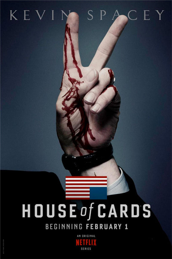
The portrayal of such violence was a daring move on behalf of the advertisements producers. Displays or representations of violence has a documented effect on viewer's behavior including promoting aggression, fearfulness, distrust, desensitization, frustration, and pessimism (Bushman &Anderson, 2001). However, Soderlund and Dahlen found that certain violence can produce "higher levels of excitement, attitude toward the story, attitude towards the ad" and overall enhance attitudes towards that which the advertisement is selling to its viewer ("The Killer" Ad: An Assessment of Advertising Violence"). The two found that a positive reception is tied with the assumptions that the violence portrayed suggests a heightened sense of excitement and many consumers crave this thrilling content ("The Killer" Ad: An Assessment of Advertising Violence"). The producers of advertisements will try to use violence to shock an audience into paying attention (De Pelsmacker & Van Bergh, 1996). Advertisers are desperate to create ads that stand out from the noise of a plethora of others and break through the clutter to attract viewer's attention (Unnava and Sirdeshmukh, 1994). Leonard and Ashley comment on the type of advertisement which does just that calling it a "scarce resource" ("Exploring the Underlying Dimensions of Violence in Print Advertisements"). This quality of resource would prove very important to the producers of House of Cards who are seeking to promote a pilot series in the midst of online network which supplies countless viewing options. The producers needed an advertisement which could stand out from the rest in order to gain a substantial viewership to cover the financial debt of the show. Media scholars who study trends of violence in media and the responses to such content have found differences based on a scale of the severity of violence including blood and gore, perceptions of harmful outcomes, the realism of pain expressed, as well as the violence portrayed as glamorized, trivialized, punished, or praised (Wilson et al., 2002). Specifically when it comes to print advertising, there is a "limited narrative frame and short exposure time to advertising [that] may limit the consumer's ability to make judgments about the conceptual characteristics of violence" (Leonard & Ashley, 2013). Viewer's then must navigate the dimensions of motivations for violence between "moralistic and predatory" (Leonard & Ashley, 2013). Cooney and Phillips elaborate on the differences between the two forms of violence explaining: Moralistic violence is driven by a desire for justice or revenge in response to deviance whereas predatory violence is conducted by exploitative perpetrators for gain or benefit ("Typologizing Violence: A Blackian Perspective"). Baumeinster and Campbell suggest three different motivations for acting out violence including sadism, boredom, and threatened ego ("The Intrinsic Appeal of Evil: Sadism, Sensational Thrills, and Threatened Egotism", 1999). In relation to Frank Underwood, viewers see his character falling into the third category of an endangered ego. Based on events from the first season as well as general background/promos, we know that Underwood is bitter about the betrayal of his promised position as Speaker of the House and is therefore out for revenge and ultimately personal gain.
The suggestion of violence in this particular ad, communicated through blood dripping from Underwood's fingers, is successful in creating an enticing image emanating a twisted sense of excitement . The suggestion is not directly brutal but instead suggests the concept to the viewer. This creates a dark but equally intriguing and exciting air to the picture. The blood on his hands not only denotes the violence of the show but the visual representation of the expression "the blood is on your hands" conveys notions of responsibility. Underwood is a character who is cloaked in false pretenses and often manipulates others under the impression of good intentions (peace); yet not only does the blood unveil the gravity of his violence; it also symbolizes accountability for said acts of violence and destruction. To complete the interpretation of this advertisement, we must also consider textual communications. The text anchors the image, giving context for the sign. There is no description for the show; only the title, premiere dates, and location (Netflix) located in the real. The show's symbol, a simplified American flag pictured upside down and backwards, is an official signal of distress. "House of Cards" is scrolled across the width of the page in large, bold, simple, capital white letters. "Beginning February 1" is centered directly below the show's title. The air date stands out more than the word "beginning" because it is written in bolded text. "A Netflix Original Series" stamp is at the very bottom of the page and in smaller print. The company logo conveys to the viewer not only where to find the show but also the opportunities associated with the show because of its producers as well as any connotations that one associates with original series from this company. The only other textual communication included in this advertisement is the actor's name, Kevin Spacey, at the top of the page. The letters are less white than the crisp font located in the real. The letters are large and in all caps; however, less attention is draw to the name because the font is slender and diluted in color. All together, the image speaks so loudly for itself, only minimal text is required to ground the advertisement.
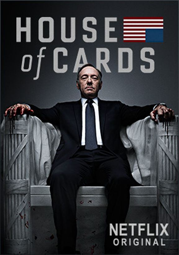
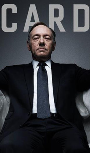
Underwood's body positioning is somewhat conflicting in nature. To one extent, sitting down suggests a more at-ease, calm demeanor. His image is very stoic in this sense; however, Underwood looks nearly perched as if bout to attack with his chest pumped out and his shoulder back. Underwood's locale demands importance, attention, and respect. He is sown as traditionally masculine with his legs set apart and hands set wide on either side, as opposed to being crossed or closed across his body in a traditionally feminine posture. His body language radiates with confidence and ability. Underwood's suit is simple, professional, and clean cut. Power is signified by every aspect of his clothing and appearance being in place and in order. His tie is straight; jacket aligned, shirt tucked and unwrinkled, and every hair combed into proper place.
Power is the most important encompassing aspect to this show, this character, and therefore to this advertisement campaign. When looking at how power is constructed, Connell says, "force and competence are … translations into the language of the body of the social relations which define men as holders of power" further explicating that this superiority of men has become "naturalized" ("Which way is up? Essays on sex, class, and culture."). Building from this, it is understood that the male body itself comes to represent power and this power is masculinized through a variety of traits (including but not limited to) physical strength, force, control, toughness, and domination (Trujilo, 2013). When we pay close attention to how Underwood's body is positioned in such a manner as to convey these notions of masculinity, a greater sense of power floods every inch of the image. Another way in which power is developed and masculinity is hegemonic is when our definition of such is through "occupational achievement in an industrial capitalistic society" (Trujilo, 2013). This idea is fully engaged by the scene that Underwood has been positioned inside of. Not only does his clothing and point of view lead the viewer to understand his status, the physical location (sitting in a replica of the Abraham Lincoln statue: an idea which will be further explored in a bit) conducts the viewer to revel in his achieved occupational status. When we move on to the finer details of the image, this same concept of power will come into an even crisper focus.
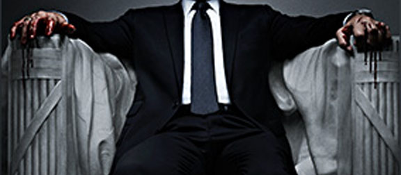
Paying special attention to Underwood's hands, we can see the deep expressive qualities which help to communicate meaning with the viewer. On the left side of the image (actually Underwood's right hand simply mirrored), the hand is relaxed, open, and almost dainty. His fingers look light and weightless as they rest on the arm of the chair structure. In stark opposition, the hand on the right side of the image, Underwood's left hand, is clinched with aggression in his fingers; the firm force of his grip is threatening. Blood coats both of his hands and drips down his fingers running down the chair arms of the statue. This visual positions Underwood as a fighter; though he rarely fights with physical force, his strength and domination are carried out in ways such as manipulation and cunning to further his social status. Fighting therefore can morph into a variety of forms. McMahan observed that the primary objective for fighting was to gain social status and consequently the respect of others (McMahan, 2013). Tough, competitive, domination is valued and this display of masculinity results in either admiration when winning or contempt when the fight is lost. The presence of this ideal can be felt throughout both the image and the show itself. In the print advertisement, Underwood is shown to be "winning", he is successful in his acquisition of power and all elements of the image work to bolster his social status. However, in the show itself, Underwood experiences great shame when he was promised the position o Speaker of the House and is later betrayed and forced to stay in his lower position. In this instance, Underwood had lost his fight and his power and masculinity were reduced. Nonetheless, Underwood is shown and proven to be a powerful fighter.
Furthermore contributing to this image, Underwood is sitting in a rendition of a great American national icon: Abraham Lincoln’s memorial statue made of white marble. Underwood's hand placement matches that of the actual statue. There is also the carving of a flag draped along the back and sides of statue. This statue is a national icon for Americans and therefore carries much significance. Connotations for the icon include patriotism, justice, and fairness. The façade of Abraham Lincoln reminds us of the civil war and tough decisions to be made in an atmosphere of internal war and conflict. Sound familiar? The producers of this advertisement combined the character of Frank Underwood and the iconic image of Abraham Lincoln's memorial statue to draw parallels and establish a connection between the signs and ideals. This chair is obviously a replica of the original. If you look closely, the image does not have the depth or detail to look "real" enough. However, this representation is similar enough for its viewer to make the connections necessary. Seeing as the show is an American adaption of an originally British show and therefore consequently marketed at an American audience, this use of American icons to convey understandable parallels between American history and the fictitious political realm created within the scripts of House of Cards.
Wrapping up, there is a glow around Underwood's head and upper body, centered in the core of the image. The light fades to darkness as it encroaches on the corners, acting as a frame for the image. The text is rather large and takes up a striking and equally large amount of space in relation to the image. The words "House of Cards" and the upside down American flag take up as much width as the frame will permit. The letters are large, bold, simple, and white; mimicking the marble statue. Though the letters are large and claim a presence, they are belittled in importance by the fact that that are located behind Frank Underwood's image (seen by the fact that Underwood's head overlaps the letters).
| Cover Page | Lights, Camera, Action: An Introduction | Discourse | That's A Wrap: Concluding Thoughts | Bibliography & Portfolio |