Dove's ProAge Campaign:
A Contemporary Discourse of Western Beauty Ideals
Print Advertising
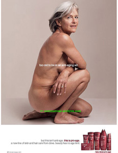
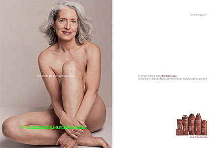
Print advertising is one of the main mediums used in Dove's ProAge marketing campaign. The females featured in the following print advertisements are among a select group of women who were chosen by Dove to model for this particular line of beauty-care. These female models are featured across every division of the ProAge marketing campaign. In Dove's original series of print ads for the Campaign For Real Beauty, "real women" were represented in large groups of female models. In the company's newer campaign for ProAge however, models are shown individually in each advertisement. All of the ProAge models share several similar physical attributes, which are undoubtedly visually striking to many viewers at first glance. Each model appears stark naked, in a sitting position, and is noticeably over the age of fifty. Based on typical female representations found in other mainstream beauty-care print ads, these ladies clearly stand out. The following images depict two separate Dove magazine advertisements that are in current circulation.
The methodology of semiotic analysis is a strong platform to begin studying these two print ads. The text on the left is a single-page ad, while the right-side text is a two-page magazine ad. They are visually very similar however, both promoting Dove's beauty-care line of ProAge products. The majority of the space in the single-page ad is consumed by a large visual image of a naked female, while a very similar image consumes an entire page (half) of the two-page text. In both instances the visual image can be described as a sign, or a unit of meaning, working from within the ad. More specifically, the concept of a healthy, elderly, Caucasian woman, living in western society, is presented as the signified aspect of the sign. Both ads are using this mental concept to indicate a signifier, a material form of this particular female image, to audiences. These visual signs also function as icons because they are photographic in nature, representing a unique real-world person. These unique real-world women are shown naked, an element that could potentially function as a punctum, having the ability to prick or disturb many viewers out of their viewing habits. In both of these ads the female figure is centralized and enlarged on the page, heightening the potential shock-value reaction to the nudity. The factor of nudity also draws more attention to both ads in general however, which provides more opportunity for communication between subject and viewer. The main difference between these two Dove models is this physical positioning of bodies. In the first example, the figure's body is turned away, with the head still facing the viewers. The second figure's head also faces the audience, but so does the body. Both women appear to be making eye contact with observers. The producers of these ads have placed each figure at eye-level with the viewers, in an effort to establish contact. Based on body positioning alone, it would seem that the images are seeking different degrees of involvement with viewers, but they actually function very similarly. The inviting looks on both faces enhance each subject's level of involvement with the audience. There is an intentional likeness between both parties, as the target viewer of this ad campaign is similarly a healthy American female of middle to upper-middle class, and at least fifty years of age. When an observer submits to these similarities by identifying with the figure, an imaginary relationship has been established.
In both texts, there is an identical image of red coloured products located in the bottom right-hand corner, serving as the ad's mortise. Although the mortise consists of several individual products, they have been framed as units belonging together. The caption below the units reading "new dove pro-age", re-affirms that the products have been given a collective identity. At this specific location, the hyperclear representation of ProAge products assumes the role as the new and valuable information in the advertisement. In order to explain the essence of Dove's new beauty-care line, two identical compositional signs have been included in both ads. Viewers are first meant to read the words "too old to be in an anti-aging ad", which are sprawled across the naked chest of each ad's female figure. Viewers are then meant to read the second compositional sign, located in the first ad at the bottom and to the left of the mortise, and in the second ad, at the center of the second page. The image goes on to say, "but this isn't anti-age, this is pro-age. A new line of skin and hair care from dove. Beauty has no age limit." The first compositional sign is intended to address the ad's unconventional representation of a female model. Viewers may agree or disagree with whether or not this woman is too old to be posing naked in a beauty-care ad, because either way they are interacting with the text. The second compositional image is adjacent to (or on the same page as) the mortise, in order to associate the ProAge products with Dove's unique definition of female beauty. This text explains to viewers that the term 'pro-age' has been created to defy the more commonly used term, 'anti-age'. Although this advertisement is relatively simple in its use of signs, there is a fluid movement between each image that effectively communicates a unique discourse of western beauty ideals to its audience. Unique to the second advertisement, there is a third image of text that is located in the upper right corner of the second page. This image is comprised of the customary Dove symbol, alongside the ProAge website address. In the event that viewers might want to learn more about the ProAge products, this Internet website is a more detailed advertising medium for consumers to explore.
Although both of these print advertisements work separately to promote the notions of beauty expressed by Dove, their similar patterns of intertextuality also create a unified discursive formation. Through the methods of discourse analysis I, the nearly identical visual images of the female figure can be labeled as visible aspects of the ProAge campaign, that both adhere to the concept of ageless beauty. In order to escape from traditional, hegemonic views of female beauty, these print ads are both absent of any images that might adhere to them. The ProAge marketing campaign has chosen to produce print ads that are strikingly similar so as to maintain a discourse organized by a coherent pattern of statements. All of these visual and compositional statements persuasively define a social world for American women 'of a certain age'. The discourse of Dove's socially constructed context is maintained by their marketing medium of print advertising.
BACK HOME NEXT