GlaxoSmithKline's Anti-Doping Campaign for the London 2012 Olympics
 |
 |
 |
 |
 |
 |
 |
 |
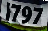 |
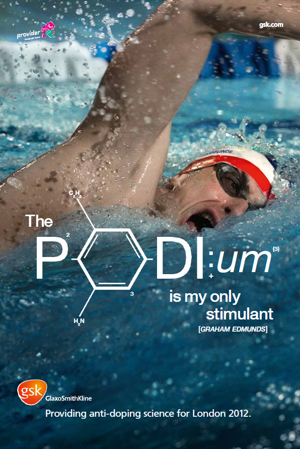
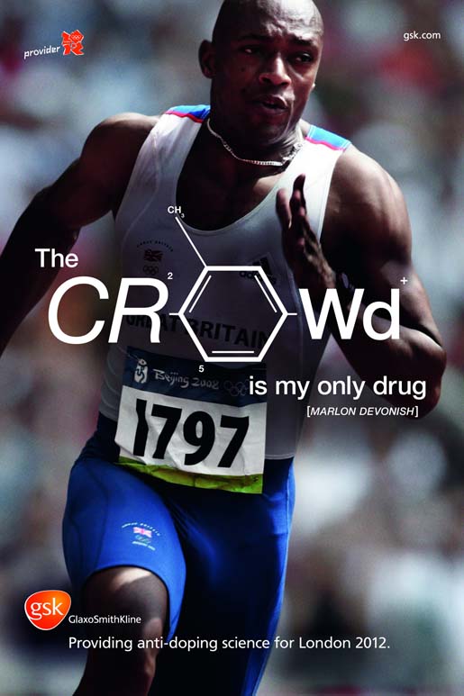
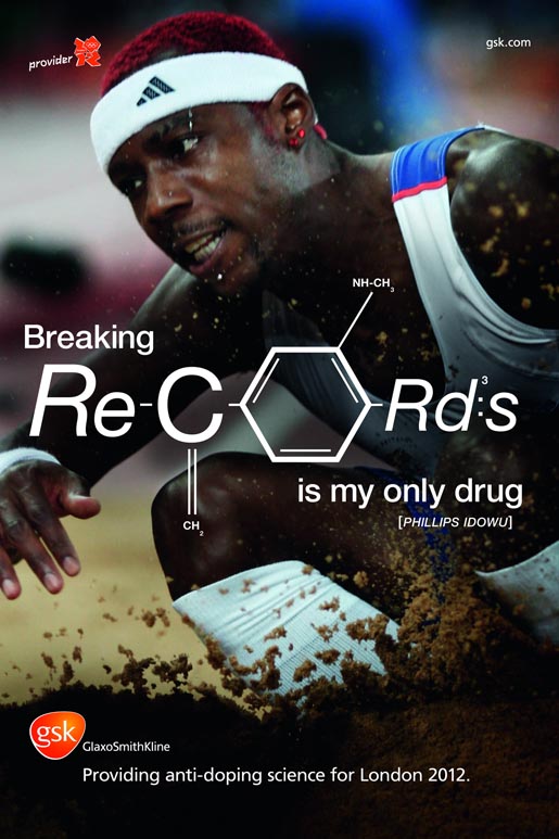
In this first section, the core images of the campaign will be shown. Take note that GSK's decision to use a campaign over a single ad allowed for the repetition of the message which "has been found to be positively related to advertising effectiveness" (Jeong, 88). The four images featured here include Paralympic swimmer, Edmund Graham, Paralympic wheelchair athlete, David Weir, Olympic sprinter Marlon Devonish, and Olympic Triple Jumper, Phillips Idowu. The ads mention the people's names but nowhere does it say that they are Olympic athletes. This, however, can be inferred because of what Ferdinand de Saussure calls signs, or the basic unit of language (Rose, 113). As Rose explains Saussure's term in her text, Visual Methodologies, the sign has two parts called the signifier and the signified. The signified is the concept or object that is derived from looking at the signifier, the sound or image we attached to that concept or object. In this campaign, the person serves as the signifier. Their red, white, and blue uniforms, the numbers, their expressions, and either the crowd in the background for Weir and Devonish or the flying water and sand for Edmunds and Idowu serve to help us attach the signified "athlete" or even "Olympic athlete" to those men. These also help specify the "Olympic athlete" as a stigmatic sign. As is defined in Rose, "syntagmic signs gain their meaning from signs that surround them in a still image" (Rose, 119). This sets the foundation for the campaign's use of athletes in action for power over the audience. |
|
In the top left corner of each image there is the symbol for the London 2012 Summer games
with the word "provider" in the Olympic font beside of it. The symbol is a geometric "20-12"
with two numbers on top of the other two. For the images of Graham and Weir, the symbol is
fuchsia, green, and purple to represent the Paralympics and for Devonish and Idowu the
symbol is red for the Olympics. A symbolic sign has "a conventionalised but clearly a
rbitrary relation between signifier and signified" so even though the oddly shaped
"20-12" block letters with "London" and the Olympic Rings inside were a clear sign of the
2012 London Olympics, there was no rhyme or reason as to why those became the games'
global recognizer and not the circle of Olympic ring-colored leaves like was the symbol
in the Sochi 2014 Winter games (Rose, 119).
In the upper right hand corner is the company website, gsk.com. This text is rather small but is the same size as the company name at the bottom of the page. In comparison to the larger text underneath it, the company name takes a backseat to their pride in "providing anti-doping science for London 2012" and the power that comes from an athlete performing. This campaign is not a direct ad for the company; it's an ad to promote a clean Olympic games, which in turn benefits the company. The campaign serves the "duel function of promoting the company and fulfilling corporate social responsibility objectives" (Taylor, 461). The text "providing anti-doping science for London 2012" is at the bottom of the page. It has a centered alignment beginning right underneath the company name with their orange "gsk" symbol beside it. |
 |
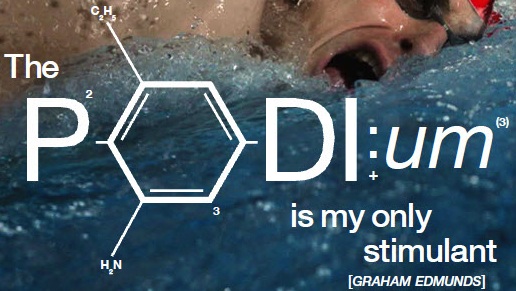 |
In the center of each image in front of the featured athlete is a statement by the athlete claiming that they are drug free and then their name. For each statement, the second word is much larger-the biggest piece of text/graphic on the page and is transformed to look like a chemical equation. In turn, this becomes the focal point of each ad. Graham Edmunds' quote says, "The podium is my only stimulant," David Weir's says "Making history is my only fix," Marlon Devonish's says, "the crowd is my only drug," and Phillips Idowu's says, "Breaking records is my only drug." This lets the audience see the importance of the anti-doping issue in regards to the Olympics. The text is positioned to put the athlete on a pedestal. It is not a fan, it is not the company, and it is not any athlete making the claim that they do not use illegal drugs to better their ability to compete and win; it is an Olympic athlete stating and proving that people can get to the Olympics without needing to use drugs to boost their performance. This is what Yongjun refers to as a promotion focus where athletes "regulate their behavior toward positive outcomes" instead of trying to prevent bad ones (Yongjun, 71). The athletes aren't trying to prevent getting caught doping they are trying to succeed through using the crowd, the podium, and history as the source of their "high". The words also tap into what athletes yearn for through participation in their sport. Athletes want to make history, be on the podium, hear the crowd call their name, and break records. As an athlete, I know that the desire to reach those goals is strong but being able to reach those goals through personal determination and hard work is more rewarding. This ad serves to remind athletes of that. It is a regime of truth, "the particular grounds on which truth is claimed" (Rose, 193). Through utilizing the power of an athlete and what it means to be one, the advertisers hope to persuade the audience to stay away from using drugs to help their performance. |

| Looking at the images, the athletes are all positioned in a frame that draws the viewer in. Not a single image shows a full body shot of the athlete. As Jewitt and Oyama explain, "To see people close up is to see them in the way we would normally only see people with whom we are more or less intimately acquainted. Every detail of their face and their expression is visible" (Jewitt, 146). The audience can see the strain of veins in their necks and on their faces, the teeth in their mouths, and the whites of their eyes. The audience is positioned right there next to the athlete so that the athlete can draw them in. In doing that, the audience is supposed to be able to hear the water splash, see their muscles work, feel the sand flying. They are supposed to be wrapped up in the moment so that they can "feel" what it is like to be able to be that great without having the help of illegal substances. The point of view also helps connect the viewer and the athlete. The point of view "increases audience identification and involvement with [the] represented participants" (Jewitt, 147). In each of these images, the photograph was taken from a slightly lower angle. This positions the viewer underneath the athlete so they must look up at them. It is an appropriate angle because our culture has been shaped to view athletes as role models, idols, the people we aspire to and dream of being. This point of view puts the athletes on a pedestal just as the text does. The athletes are positioned as heroes and since it's a cultural myth that people want to be just like their heroes, the ad manages to grab the audience's attention. | 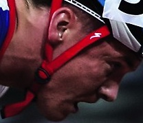 |
Graham Edmunds image
David Weir image
Marlon Devonish image
Phillips Iduwo image
Paralympic Logo
Jeong, Yongick, Hai Tran, and Xinshu Zhao. "How Much Is Too Much? The Collective Impact Of Repetition And Position In Multi-Segment Sports Broadcast." Journal Of Advertising Research 52.1 (2012): 87-101. Communication & Mass Media Complete. Web. 9 May 2014.
Jewitt, Carey, & Oyama, Rumiko, "Visual Meaning: a Social Semiotic Approach," In Theo van Leeuwne & Carey Jewitt (eds.), Handbook if Visual Analysis (London: Sage, 2001). pp. 134-156.
Kress, Gunther, & van Leeuwen, Theo, "The Meaning of Composition," in Kress & Van Leeuwen, Reading Images: The Grammar of Visual Design, 2nd Ed, (London: Routledge, 2006) pp. 175-214.
Rose, Gillian. "Discourse Analysis I." Visual Methodologies: An Introduction to Researching with Visual Materials. 3rd ed. Los Angeles: Sage, 2012. 189-226. Print
Yongjun, Sung, and Choi Sejung Marina. "Increasing Power And Preventing Pain." Journal Of Advertising 40.1 (2011): 71-85. Communication & Mass Media Complete. Web. 1 Apr. 2014.