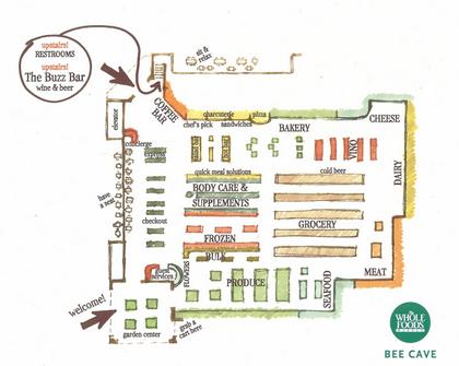

At the bottom of this page you will have two options:
1. To see the consumer's view of the visual discourse they are bombarded with each time they step foot into a grocery store.
2. To see the producers strategy in placement of objects and the site.
Each side of the grocery experience will bring you to the same conclusion, to sell or be sold the products that are in front of the consumer. I will discuss the fact that as a consumer you go into a grocery store with the intent to buy and consume, while producer have the intent to sell for consumption. In our case, shoppers can be viewed as the audience member, being exposed to a variety of "point-to-purchase advertising" (Ittersum, p.132). I intend to lead you through a road map that will help you to experience why audience members see what they see how the producers place objects in the path of their audience. The reason I choose this subject is because as consumers, weather we are being tricked into buying or not, we will still shop and still buy. So best of luck in learning about the visual sites placed in your grocery experience:

Shopping for groceries: An incredibly routine, mundane, daily action of the average person. Yet when you think about it, most times you walk into a grocery store you deviate from the norm and buy more than what's on your grocery list. This project intends to allow a consumer to see a more in depth analysis of how and why producers use the space in a grocery store the way they do. "The growth of the retail industry in recent decades spawned the development of a complicated system of ways to encourage purchases at the store" (Van Ittersum, p.142). I will dive deep into the idea of a stores space defining and drawing in consumers to buy and see things that they had not originally intended to buy or see. Many of the decisions we make as consumers are constitutive elements of the things that we are bombarded with every day. Advertisements on television telling us what we should buy, billboards on the side of the highway, radio commercials selling the latest and greatest; and just the same, the visual sites that surround the consumer in a grocery store directly influence their choices when shopping.
As Greg Dickenson states in such beautiful terms in his essay over visual rhetoric in a grocery store "Here, in the grocery store, the forces of global capitalism, the contemporary transformation of transportation, production and packaging technologies and the discourses of postmodern consumer marketing intersect with the lived bodies of individuals. Located at these intersections of these elements of the contemporary condition, the grocery store -- as banal as it may be -- is a crucial place for understanding everyday, visual rhetoric in a postmodern world."(Dickenson, p.164)
The Case Study: The map you see at the top of the page is a map of Whole Foods. Whole Foods as a grocery store is not exactly analogous to every grocery store in North America, but because of its unique attributes it is a place to begin my research. Whole Foods allows the consumer to spend more than just time allocated to shopping in its stores. It along with a couple of other chains have become to make the shopping experience more of a community than just a store to buy groceries at. It has created room for daily use as well, eating, sipping on a foreign espresso, shopping for clothes, sitting in the cafe, it becomes a hub for rest and relaxation for many of its visitors. This specific store has the "ability to draw community from its visitors" (Thompson, p.29). Create a space that connects particular problems of the average consumer (like not having enough time to eat and shop) and condenses them into an area where they can all be solved. Marketing at its finest. Many other chains have begun to do the same thing, HEB, Walmart, Target ... etc. But stores like this not only connect the disfunctionalities of everyday life, they construct our space. The things we surround ourselves with on the daily become a part of us, our space defines us. Unfortunately, when addressing the issue of our space defining us ... we see that "Visual rhetoric ... is a complex problem, a problem for which we have, at best, partially constructed solutions."(Dickenson, p.262) We are torn between the constant struggle of us making our own decisions when we walk into a space, and our space telling us what we do. This means that "visual rhetoric in the build environment seldom if ever functions alone". Our everyday spaces that surround us serve as a site for negotiation (Dickenson, p.265).


