 |
 |
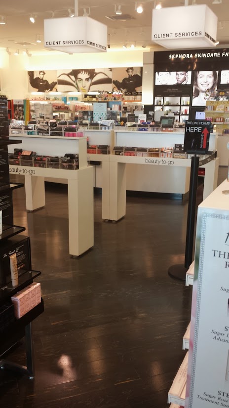
| A third aspect of the of the store is the way in which the setup of the check out is handled. It incorporates the display, textual and visual, and layout technologies. Since most companies incorporate the following belief that: "Retailing is all about volume, speed and variety", Sephora incorporates these three aspects into it's checkout area" (Grindle 682). Before one can get to the checkout, there is a maze one must go through in order to reach it. This maze is made up of open boxed display cases that hold different types of products. All of these products are labeled as "beauty to go", making these products into objects that are marketed to make you beautiful when on the go. This is done by insinuating to the subject the they can use these products to make them beautiful when getting from one place to another or in a quick manner. These products are being advertised in a way that makes the consumer believe they will be beautiful if they incorporate these products onto their skin, "For example, as Kover's (1995) examination of such implicit theories indicates, many copywriters appear to assume that if persuasion is to occur, advertising first must break through consumers' presumably vegetative media viewing state and media clutter and then deliver a message that target consumers necessarily will respond to actively and emotionally in a resource-intensive manner .."(Meyers-Levy pg.12). What the media is doing is relaying on the impact advertisements and labeling can have on the consumer psychologically so that these psychological effects can create a subject that will be the perfect candidate for purchasing their products. Sephora does that specifically by labeling their products in a way that makes the consumer believe they will be beautiful once they start using their products. In this case making the customer believe that once they use these products their beauty will be enhanced or maybe even be beautiful now that they are using said products when on the go. |
| Checking out takes time, and when a subject is at the counter, if it's a busy day there will be a waiting line to check out. What Sephora is doing is relaying on this wait as a last chance opportunity to buy more products. There is a study that elaborates on the relationship between stores and product placement "Consistent with the industry adage that 'unseen is unsold,' research consistently reports that shoppers often use physical products in the store as external memory cues that create new needs or triggers forgotten needs (Inman and Winer 1998; Kollat and Willett 1967; Park, Iyer, and Smith 1989). Sephora is subconsciously reminding their customers that they need to be beautiful on the go in hopes of triggering the need to be beautiful and hook them into buying the products in those bins. The checkout line can be seen as a forced travel within the store because the customers have to go through the maze of products to get to the checkout. Hui explains this unplanned in-store travel, "Thus, strategies that encourage shoppers to travel more of the store may increase unplanned spending by exposing shoppers to more product stimuli during their shopping trips." ( Hui pg.1). What the store does is place products inside plastic see through bins that form a trail that leads to the check out line. The customer is therefore placed right in between the products while waiting to pay. These objects are placed right next to the subject so that the subject is forced to interact with them. |  |
|||||||||||||||||||||||||||||||||||||||||||||||||||
| This forced interaction creates a relationship between the products in the bin and the customers. Since the objects are placed with signs that present them as objects that make you beautiful on the go,they are potentially useful and appealing to a subject that is possibly often on the go. This sign insinuates that all subjects are constantly having to go from place to place and sometimes don't have time for much. By having these products handy the customer can now potentially always be "beautiful". This brings to life the idea that one can even be beautiful on the go, but that this beauty is created through the use of these objects. Without the created idea of beauty coming from these products when used by the subject, their relevance is gone. Since the subjects are placed right next to these objects right before they buy the other objects, they already traveled throughout the store. It creates the idea that they possibly might need these objects because of the amount of time they are placed they spend in line. This product placement allows for the sales of these items to increase. This setup is the store's final attempt at increasing its revenue and is also an alternate way in which they sell beauty through their products and placement. |
| Grindle, Jeremy. "MODERN TECHNOLOGY IN RETAILING." Journal of the Royal Society of Arts 133.5350 (1985): 679-94. JSTOR. Web. 30 Apr. 2014. | Meyers-Levy, Joan, and Prashant Malaviya. "Consumers' Processing Of Persuasive Advertisements: An Integrative Framework Of Persuasion Theories." Journal Of Marketing 63.4 (1999): 45-60. Communication & Mass Media Complete. Web. 24 Apr. 2014. | Hui, Sam K., et al. "The Effect Of In-Store Travel Distance On Unplanned Spending: Applications To Mobile Promotion Strategies." Journal Of Marketing 77.2 (2013): 1-16. Communication & Mass Media Complete. Web. 27 Apr. 2014. |