|
|
|
|
|
|
When
all of the advertisements are woven together, Apple's campaign has
one distinct design. This design is consistent and recognizable,
therefore allowing each advertisement as an individual to strengthen
the other advertisements' ability to interpellate consumers, because
they all relate to each other in an intertextual sense. This design
has created a world, and this world has a dominant place within the
world of advertisement and technology. The texts that make up the
discourse create a common thread amongst themselves that helps the
viewers of the advertisements more successfully identify the
preferred meaning. Therefore this world has developed truth claims
that flourish among the minds of the consumers leading to more
wanting and more buying. The discourse of Apple's advertisements
does exactly as Nicholas Green states when quoted by Rose. Discourse
is "a coherent pattern of statements [linguistic, visual, material,
etc.] across a range of archives and sites" (Rose, 149). Yet, the
discourse of these sleek and simplistic advertisements is not
pointless or merely to allow one to recognize the design patterns
across texts. The discourse has more power than to simply allow one
to begin associating Apple with white screens, hands, and beautiful
products. It is complex and much more than a combination of
different texts. Cook explains that "discourse—especially discourse
as complex as advertising—always holds out more to be analysed"
(Cook, 5). The discourse works as a persuasive tool. It "refers to
groups of statements which structure the way a thing is thought, and
the way we act on the basis of that thinking" (Rose, 142). It claims
throughout many texts that there is a truth being spoken and a
knowledge that is evident. The texts then become sources that
support this truth and knowledge.
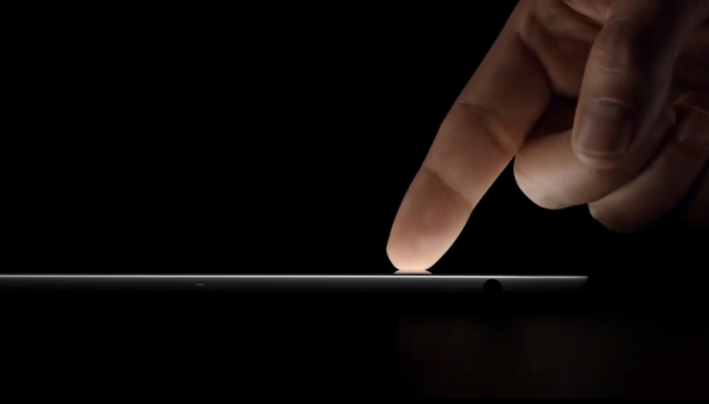
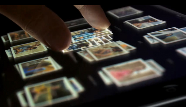
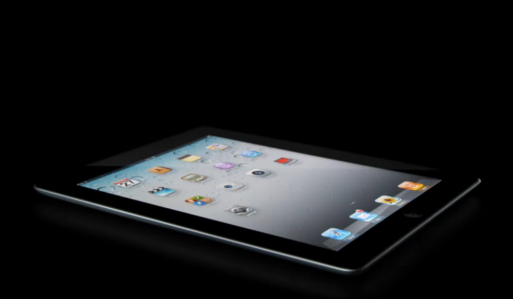
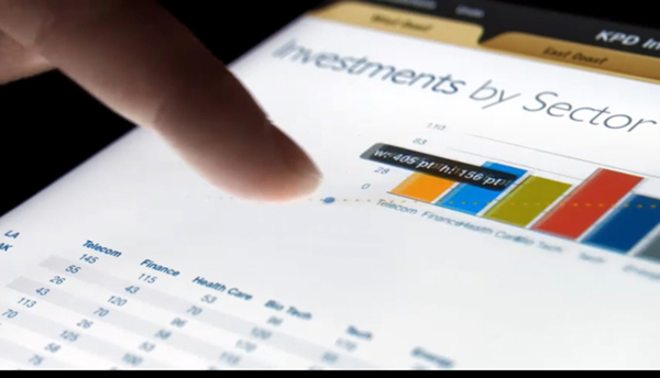
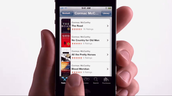
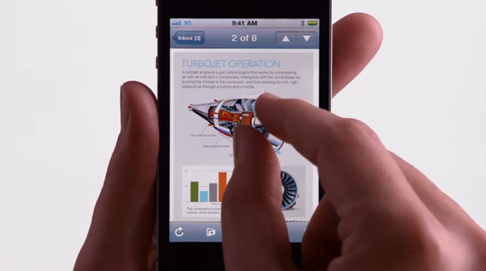
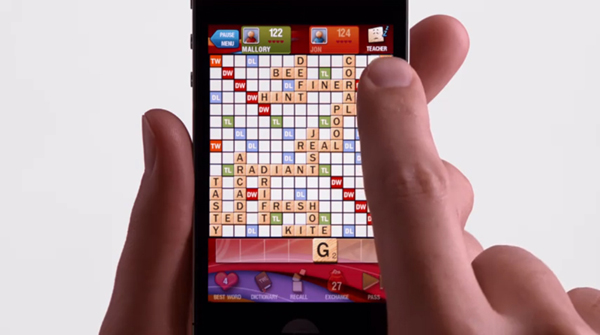
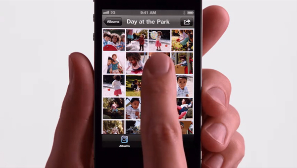
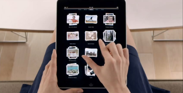
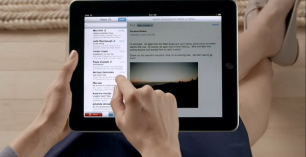
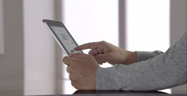
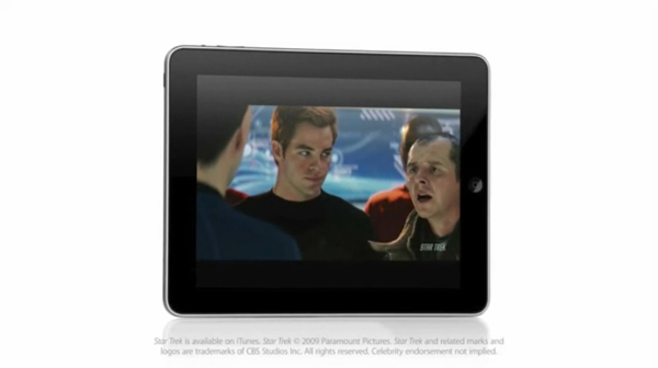
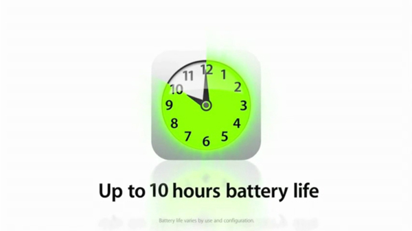
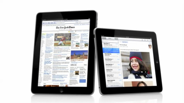
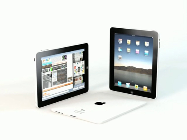
The actual organization of the discourse creates a structure that can produce a certain type of knowledge. Apple's particular organization amongst their advertisements varies from ad to ad, yet this rhetorical tactic leads to a certain way of seeing. When viewers look to these advertisements, they see all of the different elements that form the text, but when you dig deeper, they are truly seeing what the particular discourse describes to them. With Apple advertisements specifically, they construct success and simplicity. They categorize preferred lifestyles and present them in different manners. They organize their elements into a pattern that makes these lifestyles seem desirable. If we start with the four images in the top left hand corner, we see that the dark backgrounds and specific angles format the iPad into an item that seems futuristic and powerful. With the close view of the screen, one can see all of the iPad's capabilities, and the ease at which a fingertip can access them. If relating these images to each other, they strengthen the idea of futuristic ease which can lead to futuristic power. Often dark colors may not be used to present an item as desirable or admirable. Often brighter colors may allow for the product to be more salient within the text. Yet, in these screenshots, it is apparent that the darkness is used to help focus on the simplicity of the product and make central the idea of ease at which it can be utilized. With the screenshots in the top right hand corner, we see examples of iPhone4 screenshots that all replicate the same format. What differs is the actual content on the screen. The screenshots are taken from multiple advertisements, yet they maintain the same appearance. The placement of the product, and the straight forward screen shot, focus on the same signs as the screenshots from the top left hand corner. There is a focus on the hands, the screen, and the product itself, but these screenshots have utilized those signs to present the same ease and simplicity, but have done so with bright colors and a more relatable stance. This stance is one that many iPhone users often have when using their phones, therefore the advertisements read as less power driven than the advertisements that use abstract camera angles and dark colors. They appear as fun and driven by happiness and freedom, ideals that the blank white screen can reify. To reach into a more relatable realm, the screenshots on the bottom left hand corner are from advertisements that seek to step into the real world. They want to be in your, everyday life. They are not set against a solid black or solid white background that allows the viewer to make their own assumptions, but it sets the product in a world that the creators assume is your world. This allows for the assumptions to be limited. These advertisements are driven my familiarity. The screenshots in the bottom right hand corner almost combine those of the top left and top right. They use the white background as a positive and desirable atmosphere, but also present the product in a very presentational way. The screenshot that states the iPad has "Up to 10 hours battery life" helps create their need to present the iPad instead of create a relationship between the user and the product. All together, these screenshots may not look identical, but they all work together by using the same signs and the same ideals. If one was to accumulate all of these screenshots and even more from other advertisements, it would be apparent that these images come from advertisements that seek to support one another. By supporting the others, they strengthen the narrow scope that Apple hopes to push their viewers towards. A scope of sight that says, "Here is a product that will make your life easier by being easy to use." Together they work as a unit. |
|
|||||||||||||||||||||||
|
|
|