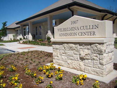
Conclusions: Progressive Traditions in the Wihelmina Cullen Admissions Center
Conclusions: Progressive Traditions in the Wihelmina Cullen Admissions Center
In the Wilhelmina Cullen Admissions Center, there is an intriguing struggle between traditional and modern that plays out in different ways. From their website and the way they use Pirate Bikes in their pamphlets to the architecture itself, there is an ever-present need to, perhaps contradictorily, label Southwestern as simultaneously traditional and modern. In this site, I parse out the ways in which the WCAC performs both progressive and traditional values, and look at how these performances complement/contradict one another. The WCAC attempts the best of both, representing Southwestern as an institution with traditional roots but progressive values.
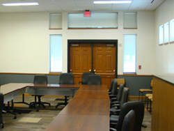
The architecture itself embodies this tug-of-war between modern and traditional in several ways. On the inside, the WCAC is clearly a new building. The ceiling is taller than any of the walls and the big skylights allow sunlight into all areas of the building. There are frosted glass partitions and plaques, card scanners next to doors, and a flat screen TV that all reinforce this. In the "Refreshments" area also, there is a coffee and a glass-paneled mini-fridge full of bottled water available to visitors. On top of all that, the building only opened a few months ago.
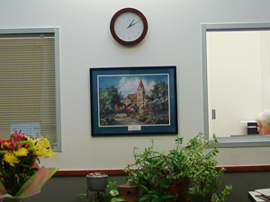
| On the other hand, as I mentioned in the introduction, the WCAC clearly plays into older architectural styles. In Dickinson & Maugh's (2004) analysis of the Wild Oats Market, they state that postmodern buildings "rather than reveling in a freedom to quote from and critically comment on historical styles, draw much more carefully on single historical styles thereby creating building and landscapes that have an image of the old" (p. 263). No matter how modern the functions of the building are, it never loses this "image of the old." On the exterior, for example, the style of the bricks and columns clearly references the older architectural styles of the surrounding buildings. Also, despite the Cullen building being just across the road, there is a painting of Cullen that hangs right in the center of the wall behind the front desk. |
|
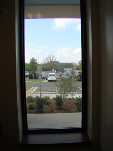
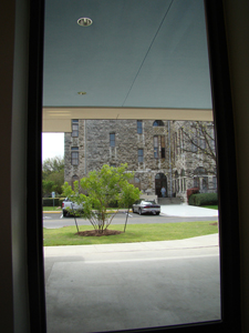
| Similarly, this plays out in the view from the windows. In the main lobby, there are only two main windows to see from. The first window gives visitors a view of the green parking spaces discussed in Green Discourse. The second gives a direct and clear view of the Cullen building. One window reinforces Southwestern's progressive environmentalism, while the other gives a view of Southwestern's century old Cullen building. This limits how visitors see Southwestern from inside the WCAC, giving them a carefully controlled vision of the university. |
|
|
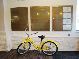
The first two things to look at when you walk in are the stationary Pirate Bike
and the frosted glass panels that outline the WCAC's LEED (Leadership in Energy and Environmental Design) certifications.
Neither of these pieces has any actual function, but are there to give performances of those concepts.
As I delve into in the Pirate Bike page, this stationary one serves only as a placeholder for actual usable Pirate Bikes.
Similarly, as I discuss in the Green Spaces page,
the LEED certification plaque has no actual environmentally positive function but shows that the WCAC,
and therefore Southwestern, is environmentally conscious.
Like the courtroom fence in Hattenhauer's (1984) example, they have no physical function but carry symbolic meaning.
The way the Pirate Bike is placed directly under the plaque serves to connect the two concepts. While green initiatives and Pirate Bikes are seemingly unrelated, they both play into the image of Southwestern as progressive. The effect is that the moment you enter the building, you're hit with these two progressive concepts that are vital to the WCAC's performance of Southwestern. Regardless of whether there is any actual connection between Pirate Bikes and Southwestern's green initiatives, the connection is made as soon as you enter the building. |
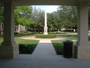
Also, when tour groups come through the building, they are led out the back door of the building to start their tour of campus. The double doors they exit through lead directly to a view of the Mood Headstone, an old, odd construction that is rooted in Southwestern's history. As you can see in the logo image, the headstone is perfectly framed by the WCAC's columns. The concept of progressive ideas built on a traditional foundation is reinforced everywhere in the construction and visuality of the WCAC.
|
|

|
This echoes again in Southwestern's web site. Even though it isn't strictly tied to the WCAC, it has some of the same performative purposes. At the very top of the page, it states "Texas' First University." Underneath the menu bar, however, it describes SU as "a national liberal arts college just north of Austin," overshadowing the following message about SU being "Texas' Oldest Institution of Higher Learning." Right underneath this text is a header that states "Right NOW at Southwestern," a further play between the modern and traditional.
|
Progressive Traditions in the WCAC: Home | Introduction | Pirate Bikes | Green Discourse | Progressive Traditions