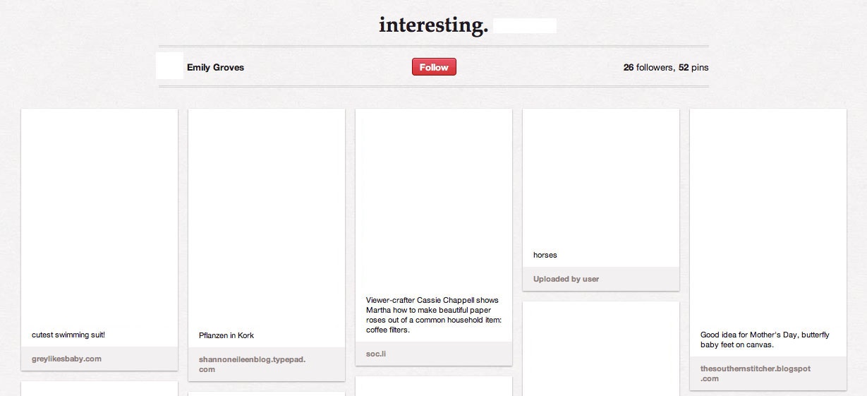
At first glance, Pinterest may seem like a very visually busy website.
There is a lot going on, but most of the action is in the form of images
uploaded by users. The design and layout is actually very simple.
It has obviously been designed to be a background, something "invisible"
that won't add anything to the visual collage it enables. This invisibility
is achieved through "seamless integration between functionality and content"
(Thorlacius, 65). The focus in this case is functionality. The site is very
user-friendly, sticking to the slogan "less is more" by featuring the linked
and uploaded images and the somewhat user-created content of the pin
boards above everything else. Because Pinterest does not restrict the content its
users post, the creators had to choose a design for the website that would
accommodate as many types of images as possible. The site enables users to
create and share their own aesthetic experience.

With the images removed, the pin board above looks very clean and simple, almost like a blank canvas or an empty gallery. Stanbridge's article "Display Options" discusses a "decontextualizing urge of the museum," displacing artifacts by putting them in "the great white castrating cubic space of the gallery" (Guilbaut qtd. in Stanbridge, 164). While Stanbridge is arguing for a museum that embraces context, an argument could also be made for an interactive museum that embraces recontextualization, as opposed to decontextualization. The key is interactivity. The virtual environment of Pinterest allows for individuals to interact with images. While the design does take images out of context, it does so in order to allow users to create their own context. In this way, the design of Pinterest can be seen as a platform for the formation of individual visual culture, something that is constantly changing.
The company logo is the most recognizable aspect of the entire site design. The unique font and the red color can be easily picked out on other websites, especially in the case of the "pin it" button, which is usually placed next to the logos of Twitter, Tumblr, and Facebook, all of which are blue and feature a single letter or shape.