|
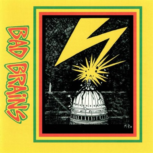
Bad Brains' self-titled album, easily my favorite of all their efforts, might be taken as a reggae album strictly judging by the cover. The red, yellow, and green evoke thoughts of Rastafarianism and act as a visual confirmation of their religious affiliation; Bad Brains "simultaneously [honors] the past--- including its ideas, traditions, and mores--- by recreating it, and [transforming] that same past, by inventing an revising it" (Maskell 412).
The logo-esque text "BAD BRAINS" appears on the left side of the cover rotated 90 degrees so that the words go down the album vertically. In the center is a picture of the downtown D.C., the Brains' hometown, with the capital building in the foreground and the Washington monument in the background. While the Washington monument seems to be included purely to help identify the particular city being depicted, the capital building is the main focus.
A bolt of lighting is striking the top of the Capital causing the dome to crack and collapse. The Capital building, in this case, serves as a metaphor for the United States and the lighting bolt is no doubt analogous to Bad Brains. The band not only shook up D.C. with its hyper-fast instruments and cackling lyrics, but also the local punk scene itself. I would normally attribute the minimalistic design of their self-titled album's cover to lack of funds, but in the case of the Brains I feel like the simplicity is intentional and says, "We don't care about the looks.
You came for the music and we delivered". It's interesting to consider the band's scarcity of visual presence in regards to the color of their skin; perhaps Bad Brain's didn't really need an iconic logo or controversial album artwork; maybe the band relied on their notoriety from being the only all black punk band to cover the need for visualization, but if you ask me it was the music that made them a success.
|
 |
