 |
|
 |
| Damaged, the bands first full-length release is widely hailed as one of the most influential punk albums to date. This album is unique in the discography of Black Flag because it was the only full-length album, other than the atrocity that is "What The..." that wasn't illustrated by Raymond Pettibon. The cover features lead singer Henry Rollins punching a mirror with his bare fist. I've always interpreted the shattered mirror as being symbolic of a shattered future, cliche but feasible. It looks as if the picture is supposed to be from a first person perspective as his arm stretches out from off the side of the cover. This visual aesthetic situates the viewer in the perspective of Rollins and acts as a symbolic sign of relation, as if it could just as easily be you on the front of the cover. This inclusive act is a key theme in punk music. You can also see the reflection of Rollins and though it is obscured by the shattered glass there seems to be a solemn look of emptiness, a man on his last leg. The violent nature of the cover ties in to themes of masculinity and aggression in punk music that often establishes the genre as a boys club. At the top is the text "BLACK FLAG" in thick red letters. Under the word flag is the bars in the same shade of red as a symbolic repetition of their name and brand. At the bottom left is the album title, "DAMAGED". The text is salient to the blood on Rollins' hand and continues the ideas of aggression. A different kind of forceful, personal masculinity is present in this album cover than the chaotic masculinity of the Dead Kennedy's album. | 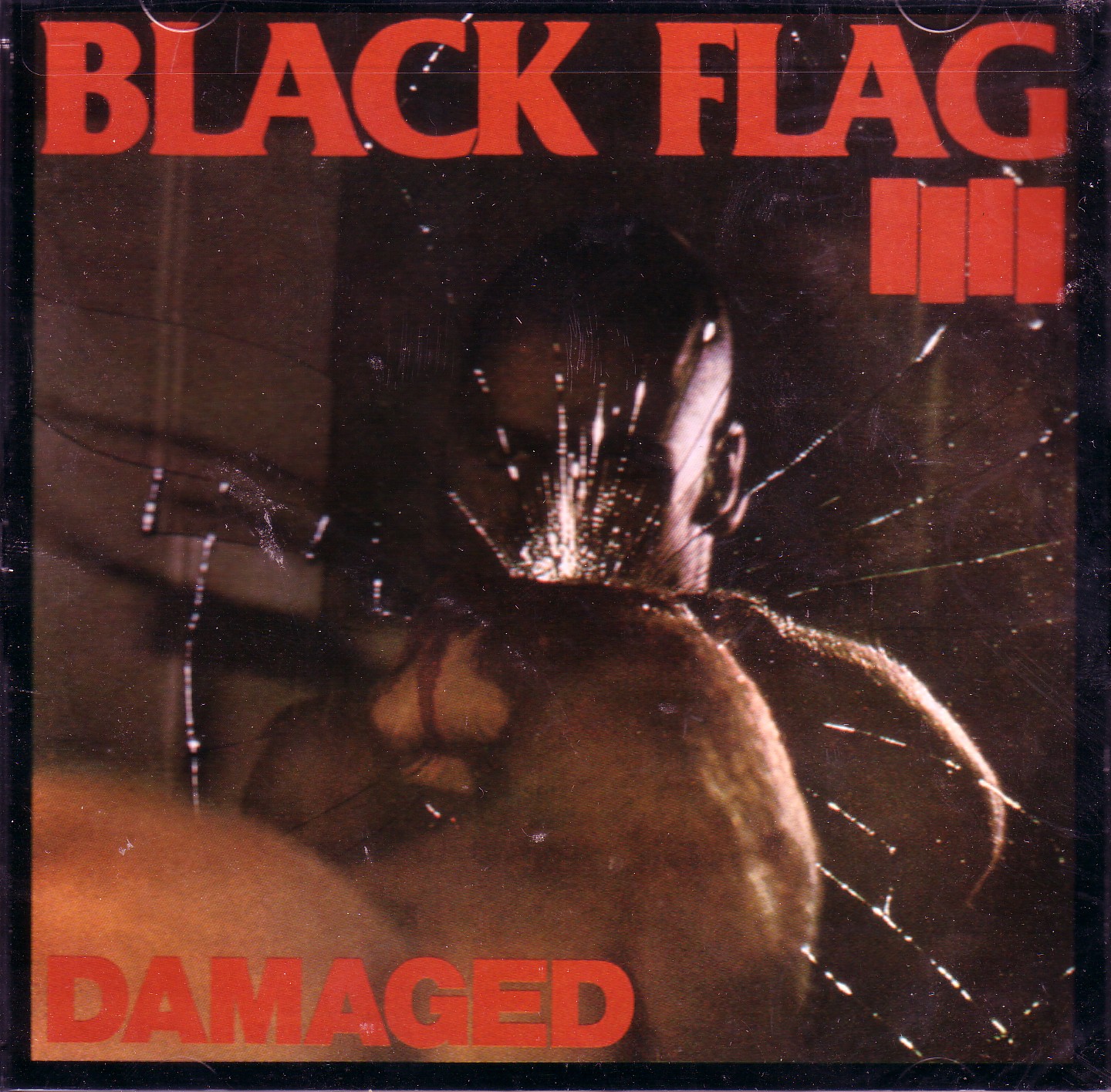 |
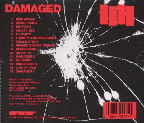 |
The backside of the album again displays the album name and the Black Flag bars. The repetition, at least of the bars, serves as a kind of branding exercise that has certainly proven to be effective. Repetition is also a very important theme to punk music where very often lines or riffs are repeated. There is a continuation of the red text as all the liner notes, track listing and even the barcode is in red. In the center of the cover is another picture of cracked glass that appears to be taken with a camera that has a seriously bright flash or edited after the picture was taken. The glass is clearly a reference to the front cover but this side fails to have any reflection in it. There could be some significance to the "invisibility", or "what is not seen or said", of Rollins on the back cover, but I don't think it was anything more than an aesthetic decision to leave the tracks as the main focus (Rose 219). |
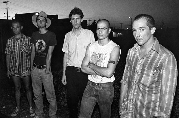
| Since Black Flag disbanded in 1986 the band has gone through similar issues to that of the Dead Kennedys. Rollins, much like Biafra, has taken up to spoken word and continues to preach a DIY lifestyle. Old band mate, Greg Ginn, has taken to milking the bands previous success through a sloppy, thrown-together album and ridiculous lawsuits. "What The...", the band's "comeback" album was not received very well and the artwork was undoubtedly one of the worst in music history, lacking even comedic shortcomings. First of all, the album art looks like it was made in MS paint by an unskilled delinquent, which may seem to be very punk/DIY in concept, but the result is pitiful. The goofy character on the front resembles something that would appear on some kind of sour candy, with a stained green tongue, and played out "rock on" sign. Unappealing green slop coats the background of the album that bears the name "WHAT THE..." in black text at the bottom. "BLACK FLAG", in their signature font, as well as the bars, seem to find their way onto the cover as if haphazardly placed there by a child experimenting with glue and scissors. I could be entirely wrong in my analysis, maybe this album art is a way of saying "fuck you" we don't care and we're going to let the music sell itself, it could be a commentary on how nobody cares about covers with all the digital downloading, or many other conscious statements. But what do I really think? The album sounds like it looks, bland and rushed. "What The..." is a visual and sonic warning to the dangers of creating punk music merely for a profit. | 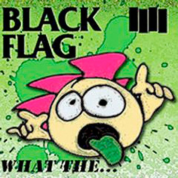 |
|
|
|