The Dead Kennedys


The Dead Kennedys are a hardcore punk band formed in San Francisco and are one of the most highly regarded bands in the scene. They were known for their satirical lyrics and unique sound that blended elements of other genres like surf guitar and rockabilly. In their 8 years as a band, the Dead Kennedys released five albums covering a vast amount of topics from Ronald Reagan to dangerous pesticides, genocide of the poor to stealing mail. The band's debut album, released in 1980, "Fresh Fruit for Rotting Vegetables" is often considered to be their most notorious.


As with most classic punk bands, the Dead Kennedys have a trademark logo that manages to evoke the band even with such a small display. The logo is a simplistic design, easy to sketch and tag on things. Large, black and white letters "DK" that pop out as three-dimensional. They're placed on a red circle that is bordered by a black background. The design is strong, bold, and stands out aesthetically. It's no wonder that this symbol caught on so well and has been spotted across the globe.

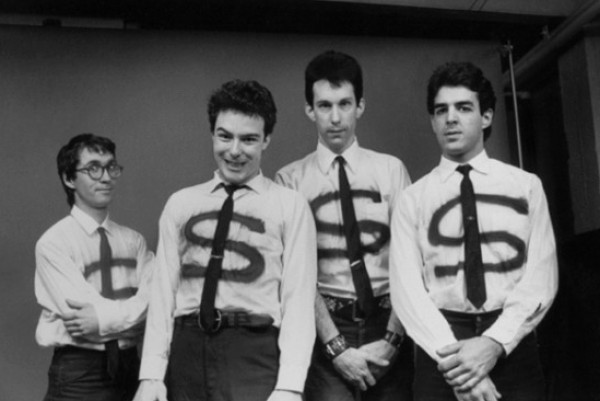
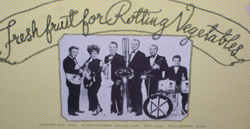
The album artwork for "Fresh Fruit for Rotting Vegetables" depicts a group of police cars that were set on fire after the "White Night Riots", which were the result of Dan White getting off with a manslaughter charge (served 5 out of 7 years) despite him murdering the mayor of San Francisco and his supervisor, in 1979 (Snider 42). Jello Biafra, lead singer for the Dead Kennedys, no doubt selected this picture because of the controversy surrounding it, especially due to its closeness to the release of the album. In picking this specific picture Biafra is purposefully playing into the "regime of truth", a concept coined by Foucault meaning "the grounds on which truth is claimed", that claims that punks hate the police (Rose 193). The picture is in black and white and is extremely grainy so it is quite difficult to make out the subject, this could be intentional to match the lo-fi aesthetic of punk or possibly due to constraints on the availability of images.
A rivalry between the police and youth/counter-culture is older than punk itself, but nonetheless is a "key theme" throughout the genre, so its no wonder Biafra jumped at the chance to put police cars engulfed in flames on his debut album (Rose 210). Though prior knowledge is required to appreciate the full story of the artwork, as per usual with the Dead Kennedy's content, one can appreciate the chaos encapsulated within a 12"x12" canvas without any knowledge of the "White Night Riots"; it is anarchy, pandemonium, and bedlam, a perfect description of the sonic value of the album. The band's name "Dead Kennedys" is proudly displayed at the top left of the album in a yellowy-gold, gothic style font. The salience in the contrast of the yellow on black and white causes the name to draw immediate attention and creates the notion that they condone this type of act or perhaps they are taking credit for the bonfire themselves.


On the reverse side is the obvious information: band members, track details, recording details, and personal thanks, but much more interesting is the picture at the top. A photo of an old lounge band from the early 70's, "Sounds of Sunshine", which Biafra inadvertently found and pasted a Dead Kennedys logo on the kick drum without the consent of the band. The band sued Biafra's label, "Alternative Tentacles", but in his typical, twisted sense of humor Biafra found a solution in cutting the heads off the people in the picture and rereleasing the album. Remixing of other's material plays a large part in the DIY scene because of the lack of available funds for original content. The majority of the Dead Kennedy's visual presence, absent of their logo, is borrowed (legally or illegally) from something else.


However, artist Greg Wright did the cover of "Kill the Poor", a single from the Dead Kennedy's debut album. The cover is black and white and was released only as a 7" record. 7" vinyl is a very common format for punk singles and splits, especially in the hardcore scene. Though the gray scale design is indubitably due to it being a sketch, the cover has dystopian vibes. In the top left of the album in big bold letters is "KILL the POOR". The text is followed by a snarky copyright symbol that most likely is a stab at capitalism in the music industry. Directly beneath the words is a bulldozer carrying charred bodies of what one could infer are corpses of the poor about to be discarded into a large dumpster. Graphic subject matter is a recurring, rhetorical theme throughout the Dead Kennedy's discography. This text is probably one of the least "polysemic" examples of album artwork I've ever seen. Polysemy is a term that describes something as having "more than one meaning" (Rose 133). In the background is a factory with three massive chimneys and billowing smoke clouds. This is clearly intended to be where the bodies of the poor are being burned and I don't think its too far fetched to assume that this is also meant to draw some parallel to the death camps of the Nazi regime, particularly when considering the frequency of references on the album to Nazis such as, "California Uber Alles". Drawing inferences such as this comes from the study of iconography, or "the branch of the history of art which concerns itself with the subject matter or meaning of works of art" (Rose 202). To read this factory as a reference to Nazi death camps I am considering it on an "instrisic" or "symbolic" third level, which examines "visual images in order to explore their general cultural significance (Rose 202). At the bottom of the front cover is "DEAD KENNEDYS" in thick, black letters that have been made to look like worn graffiti. This is particularly relevant because of the design of the Dead Kennedys logo, which Jello Biafra claimed he wanted "something simple and easy to spray-paint so people would graffiti it all over the place"; a perfect example of DIY marketing (Tremble Under Boom Lights).

The back of the single featured two remixed versions of the famous Edvard Munch painting, "The Scream". The one on the left has what appears to be a nuclear factory in the background, the colossal cooling towers releasing enormous clouds of poisonous gasses and the one on the right depicts the factory exploding in an ominous mushroom cloud. This ties into the whole World War II/Nazi/Nuclear war motifs present throughout the album. Beneath is information about the artists and the record label, Cherry Red, which released the single. In the top right is "CHERRY 16", which denotes the label and the catalog number.


Since the band broke up in 1986 there has been a great deal of tension between Biafra and the other members. Dispute arose over the other members wanting to put the song "Holiday in Cambodia", a stab at yuppie culture through a hypothetical vacation to Cambodia, in a Levi's ad. To Biafra's dismay, the other band members won the rights to the band's music/artwork and began to slap the "DK" logo on anything they could to turn a profit. Selling out is already viewed as a sign of inauthenticity in punk music, but when the others tried to make Dead Kennedy money clips the irony was too much and Biafra had had enough and was "able to shame them out of that one" (Tremble Under Boom Lights). This juxtaposition of blatant commercialism and punk is a disheartening example of money corrupting the scene; examples such as this are why punks are so staunch about their DIY ethics and weary of outside interest. Of course this is not the only example of ex-band members fighting over the rights to the bands aesthetic.


Click on one of these pictures to advance:

Back to Introduction
Conclusion


Works Cited