
LinkedIn.com is one of the oldest tech startups examined in this study. It also boasts the second largest user base of any of them (following Facebook, of course). “As of December 2012, according to LinkedIn, the network had more than 200 million members around the globe.” (Fawley, 2013) That is an extremely large number of people, almost two-thirds of the population of the United States. However, considering the service that they provide, it is not at all surprising that they would have such a large following. Nancy Fawley, writing for Online Searcher gives a succinct explanation of what exactly it is that they do in her article entitled LinkedIn as an Information Source for Human Resources, Competitive Intelligence: “LinkedIn, the online professional network, provides people with the opportunity to interact with other professionals in their fields, locate potential employers through company pages and employees, and participate in forums relevant to their professions. As an information resource, LinkedIn lets us learn more about a company, assess an individual's professional record, and gather clues about industry and social trends.” (Fawley, 2013) Obviously, this website is not about chatting with friends, sending videos, or sharing music. It is for professionals trying to find other professionals who are either looking for work or are attempting to expand their business’s team or outside connections. When put in contrast with the homepages of the startups that were previously showcased on this site, the difference between business and pleasure are clear.
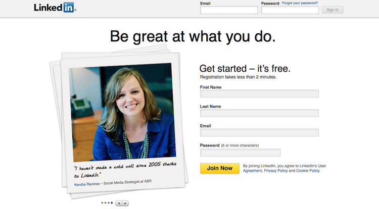
A blank white background with black, Helvetica font immediately suggests a different atmosphere than the ‘party vibe’ portrayed by homepages such as that of Turntable.fm. The only section of the signup page that boasts any real color is the picture of the smiling woman with a caption at the bottom that says ‘I haven’t made a cold call since 2005 thanks to LinkedIn.’ ‘Cold calling’ in the startup industry (whether it is a tech startup or not) generally refers to the practice of calling as many potential investors as possible in order to raise capital and get one’s business off the ground. The importance of this is that the first thing one sees when they go to LinkedIn is that it is a website that will improve your financial situation without having to go through the tedious processes of everything associated with starting a company. In any case, the somewhat dull yet straightforward approach to marketing their product reflects exactly what their market wants to see. Their potential users want a no-nonsense connectivity tool that makes them look as professional as the website itself does. Advertisements featuring the bubbly advertising face of Progressive Insurance, ‘Flo’, as seen on one of Facebook’s login pages or even the slightest mention of creating one’s own avatar would be completely out of place in this visual setting. Referring back to the excerpt from Keng Ching-Jui and Chia-Chien Liu’s work found on the page analyzing Turntable.fm, the primary users of LinkedIn are what they would consider to be “low-sensation seekers and high-need-for-cognition viewers” who neither need nor want flashy, exciting features. They are visiting the website to further their careers, not embellish their pass time.

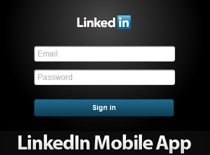
The sign in page for LinkedIn’s mobile application reflects the above sentiment a great deal. It even lacks the ‘Sign in with facebook’ option. It is candid and direct. The most exhilarating feature it shows probably the logo itself. There is no need for anything more, and in fact any extra aesthetic design could potentially dissuade new users from signing up for the mobile application.